Creating Visibly Understandable Components
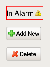
Most components have an Image Path property, which augments the text property of a component by placing an image next to it. The image can be an icon that is included with Ignition or an image such as a .jpeg or .png file.
The location of the image in relationship to the component's text is generally handled by the Horizontal Text Position property, located in the Layout section on the componet.
Adding an Icon to a Label
-
Create a Label on your window.
-
Go to the component's Property Editor and select the folder icon (
 ) in the Image Path property.
 -
From the resulting Image Browser popup, navigate to the icon of your choice and double-click it using your mouse.
The component's Horizontal Text Position and Vertical Text Position properties will change the location of the icon in relationship to the text.
Components can be customized so that it is immediately clear what it is trying to convey.
Similar Topics ...