Tutorial: The Report Workflow
Steps to Amazing Reports
There are 3 fundamental steps to creating a Report in Ignition 7.8:
-
Gather your Data
-
Design your Report
-
Schedule Delivery
Simple, right? This workflow is really the gist of what it means to create a report in the Reporting Module. Conveniently, the Report Workspace interface makes it simple to complete each step and view your result. This tutorial will provide a walkthrough of creating a simple report, and reinforce some of the concepts and terminology involved. If you are already familiar with the basics of how to create a Report, you may be interested in the Reporting Technical References. If you are in the right spot, lets go ahead and get started.
Your First Report
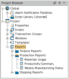
To create your first report, you will need an Ignition 7.8 installation, as well as the Reporting Module. We recommend following along with the core modules installed. If your installation is configured and Gateway running, launch the Ignition Designer and right-click on the Reports node in the Project Browser to create a new Report and open the Report Workspace.
With a new report open, you can take a look at the new Report Workspace. The top of the workspace has a series of stylized tabs which guide you through the creation of a new report. It's no coincidence that our Report Workspace is laid out in a way that lets you intuitively follow our 3 Steps with a little help along the way. There isn't much to see on the Overview of a new Report, so click over to the Data tab to get started.
Set Up Data Sources
For any Report, you will first need to specify one or more Data Sources. Click the + button to add a data source. We'll start by adding a simple Static CSV source, but if you have a database connected with a table you'd like to use for the tutorial, feel free to add a SQL Query (a simple SELECT * FROM <YOUR_TABLE_NAME> is all that is needed to pull in all the data a table contains).
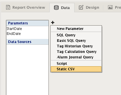
You'll now have a Static CSV Data Source editor open. Lets delete the example values and add our own. We are going to model data collected from international Widget Factories, complete with production capacity, the number of Widgets produced, and the number of minutes it took to produce them. Copy and paste this CSV data into your data source editor and give your data a meaningful name in the Data Key field.
Facility, Capacity, Produced, Minutes"California", 2000, 665, 345"Texas", 3424, 1674, 924"South Africa", 734, 232, 154"Brazil", 1131, 882, 325"China", 5324, 2764, 297"Norway", 436, 143, 383"Kenya", 1431, 423, 164"Italy", 543, 524, 234"Romania", 154, 78, 45"Peru", 624, 523, 732
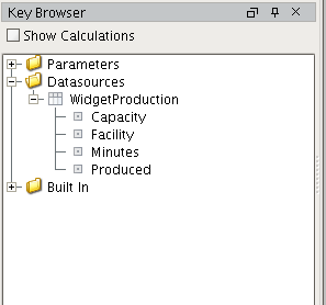
Now switch over to the Design tab, and take a look at your Key Browser panel on the left. Expand the Data sources and you'll see that each column of data is represented by its own Data Key. These Data Keys are automatically generated based on the table of data fed to the report system and are child-keys. Accessing the data from a child key is accomplished using the path of a key in relation to its parent, sometimes referred to as keychains. A keychain is simply the path to your data key using 'dot notation'. For instance, the keychain for our Facility key would be WidgetProduction.Facility.
Now that you have some data, lets create simple design and see how our data keys can be used to create dynamic reports.
Design the Report
Designing a report is the act of deciding how you want the end result to look, and laying out the pages to accomplish your vision. Each type of Design component has strengths and weaknesses in how it presents data. You may want a line-item table to look at sales of each product, or a Pareto Chart to quickly identify high-impact targets for next year's mining investment. To create comprehensive reports, you will likely find yourself combining different components. Fortunately, this is pretty easy to do using the visual designer, so lets continue our first report and see how easy it is.
For our report, we'd like to have:
-
A Header
-
A Table that gives us a summary of how many Widgets each factory produced, and the totals for each data column.
-
Factory efficiency on a units/minute basis, which we will need to calculate.
-
Page numbers will be helpful if our report gets too long, so we'll add those too.
The table will offer a lot of detail, but we know our Widget Management doesn't do well with numbers, so we'd also like to give them a chart that shows the production of each facility. To really impress, we'll use the new Pareto chart so we can point out which factories are accounting for 80% of our production.
Add A Text Header for the Page
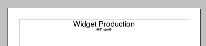
With an idea of what we want to accomplish, as well as the data to do it, we can start designing. To start we'll give our report a header with a title. We use Text shapes anywhere we need to add text to the page. Activate the Text Shape  and click-drag near the top of the page to create a field for text. Go ahead and give your report a title by typing into the field of the shape. You'll notice the text field in the lower left corner of the Designer, along with some buttons that let you customize the look and layout of the text. This configuration area will change depending on the selected component on the report. In the same area, you'll notice there is a tab titled "Properties" behind the Text Area's custom editor. This table provides access to a component's various properties. Feel free to experiment with the settings in the editor or property table to customize your title.
Text Shape Configuration Panel
In addition to a title, providing some meta-data about the report can provide context or make it more readable. For instance, adding the date the report was generated is a very common task. However, we don't want to type the date into the text field, because all reports we run (could be today, tomorrow or next year!) will show what we type. Instead, we want the date to reflect the day the report was generated. If you look at your key browser, you'll see a folder called "Built In". This folder provides a number keys that are common in reports. Go ahead and grab the "Date" key and drop it in the same text field as your title.
You'll notice that the key you dropped into the text field is surrounded by '@' symbols. The @ symbols tell the report engine that text inside (in this case Date) is a key, and it should try and find value when the report is generated. If you click over to the Preview tab, you should see today's date where @Date@ is. In addition, you'll see that the text is in the same place it was in the designer. As our report gets more complex, we'll want to think about the layout of the items on the page to accomplish the look we want.
Adding text on a page shared with a repeating component (such as a table) will add the text to all pages created by the component. In some cases, like page numbers, this is desirable. In others, you may only want a single header for your table. Tables themselves have headers, which we'll briefly talk about, but you can read about them in more depth in the Reporting Table documentation.
The Power of Data Keys
You can have multiple keys in a text field. In addition, you can use multiple keys and common numeric operators to do calculations within the @ symbols! These are called Keychain Expressions. Expressions are not something this introductory tutorial will cover, but you can head over to the data key documentation page for more information.
Adding a Table
Grab a Table component off the palette and add it to the page. With the Table selected, look in the bottom left corner under the Key Browser, and you will see the configuration panel for the Table. We want the Table to show us data about our Widgets Factories, so go ahead and grab the parent Data Key from the browser, and drag it to the Data Key field of the Table Config Panel. You'll notice that the Data Key field updates, as does the Table itself. Our WidgetProduction data key is now providing data for the table, so lets set up our table.
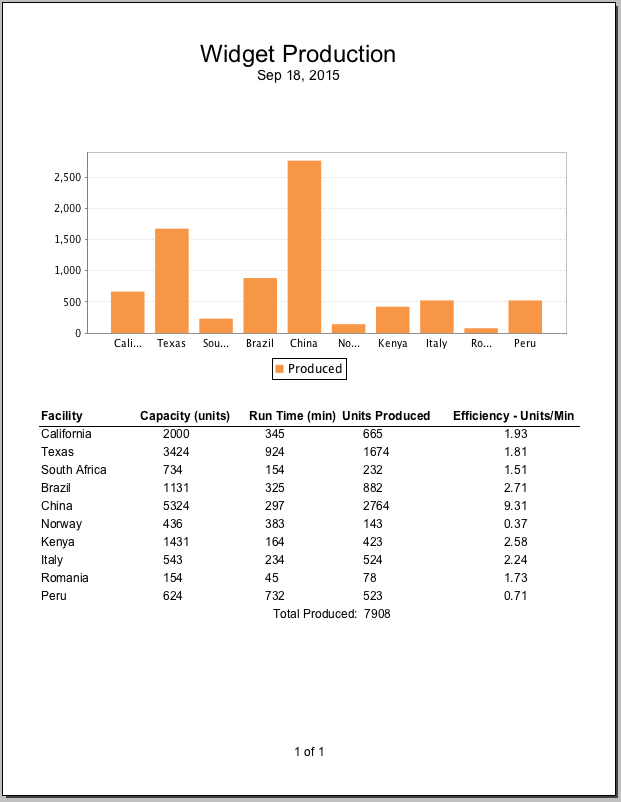
We want a header and summary, so check those boxes and lay out your table however you like. To calculate the efficiency in terms of Units per Minute of runtime, we use the keychain expression @Produced/Minutes@. Here is what we came up with, and the generated report.
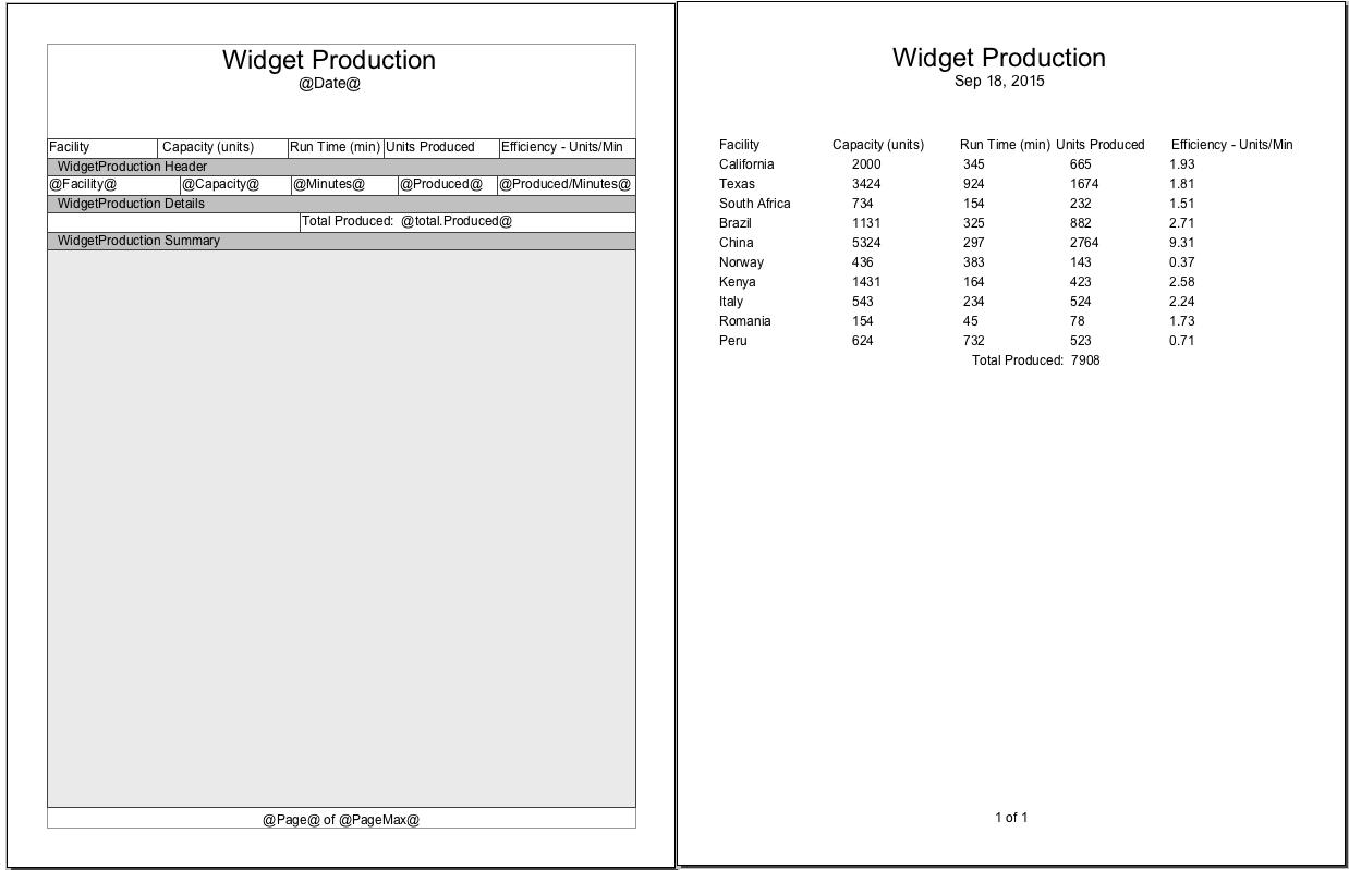
To finish the report, we just need to add a chart, we can just resize the table a little bit and add our chart right under the page header. Drag the bar chart into the space above our table, size it and the table to suite. Add the Data Key, for our data and take a look at the preview. Instantly, you'll notice the bar chart adds a bar for each column in the data, where our goal is to only show the number of widgets produced.
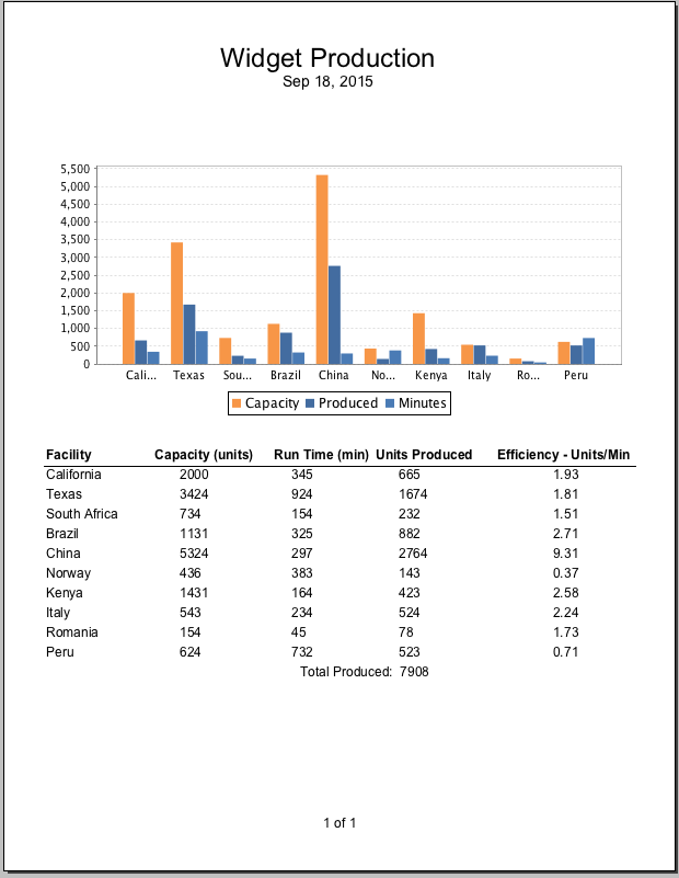
Edit Data Sources to Accommodate Requirements
If we were using Query data sources, we'd create an additional source use a nested source to get the two rows we want. For this example, we'll go ahead and create an additional data source using another static CSV source that includes only the columns we are interested in.
Facility, Produced"California",665"Texas", 1674"South Africa", 232"Brazil", 882"China", 2764"Norway", 143"Kenya", 423"Italy", 524"Romania", 78"Peru", 523
Now when we generate our report with the new data, we get a chart with the items produced, and a table summary of the different locations.
Final Product
We configured our bar chart to use the new data source, and got a result that seems to meet our goals.
Scheduling Reports
Last by not least, we finish by setting up our report to run on a schedule. Scheduled Reports are easy to setup and allow you to define a number of different Actions to occur on a schedule. For our schedule, we simply want to create a PDF of the report and save it to a local folder at the end of the work week.
Adding a Schedule
Adding a schedule is as easy as clicking on the  button of the Report Schedule panel in our workspace.
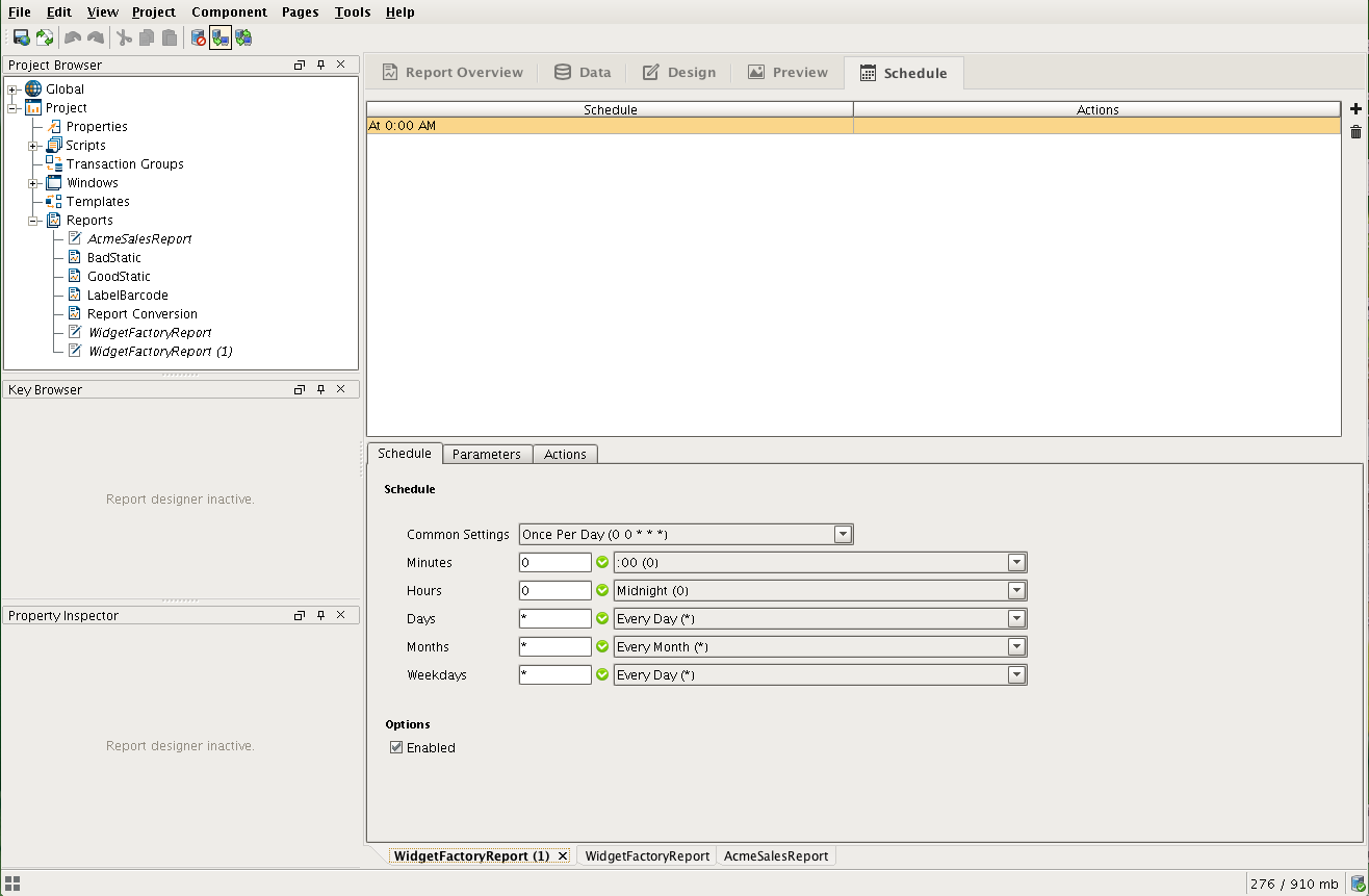
With the schedule added, use the dropdown options to determine when it should run. We set ours to run on the 5th weekday (Friday) at 23:59, or one minute before midnight. Keep in mind, this report will execute on our Gateway, so the schedule will be according to Gateway Local Time. We didn't use parameters in this report, so we can click over to the Actions tab to set up the actions for this Schedule. Here we will click the
next to the empty Action list, and select Save File. That presents us with Folder Path and FileName configuration space. We change the path from default to something that works for our system. Once happy with the settings, you can test run clicking the  .
.
Congratulations! You've completed your first report!