Reporting Component Properties
Reporting components, just like Vision components, have many different properties. Some properties are unique to certain components so it's always a good idea to look through all the properties of a component to see how they can be used to enhance your reports.
Some Report components, when selected, have an additional tab in the Property Inspector as you will see. The Reporting components that have an additional tab in the Property Inspector are shown here along with a brief description of their respective properties.
Components
Table Component
The Report Table allows you to display tabular data in a variety of ways using the Table properties. Some of these same properties may also be modified from the Properties tab.
Configure Table Tab
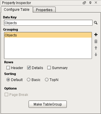
Configure Table Properties
|
Property |
Description |
|
Data Key |
Unique identifier or placeholder that points to your data. Typically a Data source is used for this property. |
|
Grouping |
Matches the name in the Data Key row that points to your data |
|
Rows |
Rows in a table. There are three types: Header Row: A single row inserted at the start of the Detail Rows. Commonly used to display column headers. Details Row: Represents the majority of the data on a table. Summary Row: A single row inserted after all the Detail Rows. Commonly used to display totals or summary values. |
|
Sorting |
Orders data in the table. Sorting occurs after the data has already been retrieved in the data source. There are three options: Default: Data sorted based on the order in which it is retrieved. When selected, the table will not sort the rows. Basic: Allows a list of keys to be configured. The data is sorted in the order the keys are selected. TopN: Uses a single key path, with a Count value that allows a limit to the number of rows that are processed |
|
Page Break |
Creates a page break between each grouping |
|
Make Table Group |
Can create 'child' and 'peer' tables. |
Labels Component
Labels can be used to print out a host of different types of labels depending on how you configure the Label properties. You can create mailing labels, name tags, generic labels, and more. You can even use the Avery Label sheets. Some of these same properties may also be modified from the Properties tab.
Configure Labels Tab
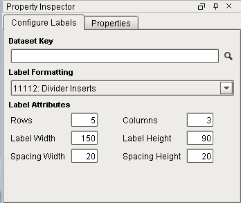
Configure Labels Properties
|
Property |
Description |
|
Data Key |
Name of the key that will populate the Labels. |
|
Label Formatting |
Choose from a list of Avery Label Formats, or create a custom sized label. |
|
Rows / Columns |
Defines the number of rows and columns per page |
|
Label Width / Height |
Width and height of labels in pixels. |
|
Spacing Width / Height |
Distance between Labels on the page in pixels. |
Barcode Component
The Barcode component allows reports to contain dynamically generated barcoded based on the how you configure the Barcode properties. Some of these same properties may also be modified from the Properties tab.
Configure Barcode Tab
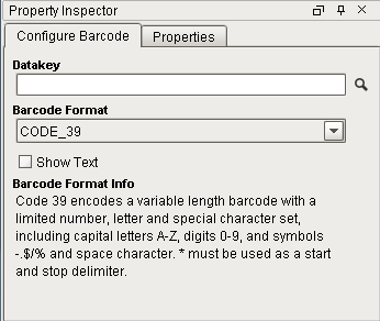
Configure Barcode Properties
|
Property |
Description |
|
Data Key |
Key that will populate the barcode. |
|
Barcode Format |
Barcode format to display |
|
Show Text |
Determines if the value of the Data Key should appear on the barcode. |
Graph and Chart Components
The Chart Options tab contains all the same properties for both the Timeseries Chart and XY Chart. You will notice that the reporting properties for the Timeseries and XY Chart components contain some of the same properties that are in the Easy Chart Customizer. These same properties may also be modified from the Properties tab.
Timeseries Chart & XY Chart Components
Chart Options Tab
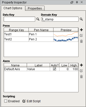
Timeseries Chart Chart Option Properties
|
Property / Symbol |
Description |
|
Data Key |
Unique identifier or placeholder to the data source that will populate the chart. |
|
Domain Key |
The data key that should represent the X axis on the chart. The Timeseries Chart expects a timestamp, while the XY chart can use any numeric value as the domain key. |
|
Pens |
Pens represent a series of data. There are several properties for each pen exposed on the Chart Options tab: Range Key: The key the pen should retrieve data from. Pen Name: The name of the pen that should appear on the chart. Preview: Visual representation of how the pen will be rendered. The trend is simply a preview, and does not take the data from the range key into account. |
|
|
Opens Pen Configuration area for editing. |
|
|
Adds a pen. |
|
|
Deletes a pen. |
|
Axes |
There are several properties for each axis exposed on the Chart Options tab: Name: The name of the axis. Label: Text next to the axis. Commonly used to describe what the values of each pen represent. Auto?: Determines if the axis should automatically adjust the upper and lower bound of the axis to include all data from each pen. When enabled, the High and Low properties are ignored. When disabled, High and Low will be used. Low: The low range value the axis will use when 'Auto?' is disabled. High: The high range value the axis will use when 'Auto?' is disabled. |
|
|
Add an axis. |
|
|
Opens Axis Configuration area for editing. |
|
|
Deletes an axis. |
|
Enable Scripting |
Enables the script for the component to run. |
|
Edit Script |
Allows the chart to be modified before the report is rendered. |
 Edit Pen
  Add Pen
  Remove Pen
Bar Chart Component
The Configure tab is present when using the Bar Chart and Pie Chart components. The Configure properties are just as the name suggests; how to configure the look and feel of a chart; rows, columns, and segment colors on a chart. Some of these same properties may also be modified from the Properties tab.
Configure Tab
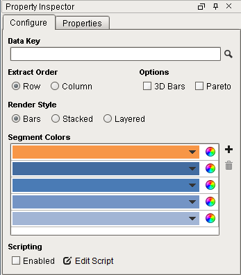
Bar Chart Configure Properties
|
Property/Symbol |
Description |
|
Data Key |
Unique identifier or placeholder to the data source that will populate the chart. |
|
Extract Order |
The order in which the data should be extracted from the data key. Two options are available: Row: Data is extracted by row. Use this when columns in the data key define the series of data. Column: data is extracted by column. Use this when rows in the data key define the series of data; each column is a new value for the same series. This is sometimes referred to as data 'turned on its side' |
|
Options |
3D: Columns and bars with 3D appearance using angle and depth. Pareto: When enabled, turns the chart into a Pareto chart. Contains both lines and a bar graph where values are in descending order. |
|
Render Style |
Provides three rendering styles: Bars: Displays data as individual colored bars Stacked: Displays data as a stacked bar in different colors Layered: Displays data as a layered bar in different colors |
|
Segment Colors |
A unique color in the RGBA color space for each segment (bar) |
|
|
Tool for creating color combinations for bars |
|
|
Adds a color / row |
|
|
Deletes a color / row |
|
Scripting Enabled |
Enables the script for this component to run |
|
Edit Script |
Allows the chart to be modified before the report is rendered. |
 Color Wheel
Pie Chart Component
Configure Tab
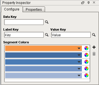
Pie Chart Configure Properties
|
Property |
Description |
|
Data Key |
Unique identifier or placeholder to the data source that will populate the chart. |
|
Label Key |
Key that will list the names of each segment in the legend on the chart. |
|
Value Key |
The key that will populate the chart with data. |
|
Segment Colors |
A unique color in the RGBA color space for each segment (wedge). |
|
|
Adds a color wedge to the chart |
|
|
Deletes a color wedge from the chart |
Shapes
The reporting component properties for Shapes uses the Property Inspector. There are no other tabs for additional properties. The reporting component properties are used just like the ones in the Vision Module. Drag any of the properties on to your Design workspace to use in your report.
|
Property / |
Description |
|
|
Click and drag to create a shape that will contain text. |
|
|
Click and drag to create a line |
|
|
Click and drag to create rectangle |
|
|
Click and drag to create n ellipse |
|
|
Click and drag to create a star |
|
|
Click points so that lines will be joined with straight lines |
|
|
Click and draw free-hand segments |


Text Shape Component
The Edit Text tab is pretty straightforward to use. Text Shape properties can be modified by the buttons on the right side of the Property Inspector. These same properties may also be modified from the Properties tab. Properties that are modified will usually affect all text in that object regardless of specific text selection.
Edit Text Tab
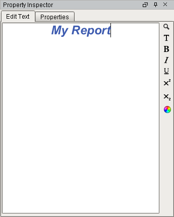
Text Shape Component Properties
|
Property / |
Description |
|
|
Data Key search |
|
|
Font, Font & Style |
|
|
Bold |
|
|
Italic |
|
|
Underline |
|
|
Superscript |
|
|
Subscript |
|
|
Font Color |


