Timeseries Chart
The ![]() is a type of XY chart whose domain or X-Axis represents time series data and range can be one or more pens. The Timeseries Chart is a great way to display visual from Tag History, or similar time related data sources.
is a type of XY chart whose domain or X-Axis represents time series data and range can be one or more pens. The Timeseries Chart is a great way to display visual from Tag History, or similar time related data sources.
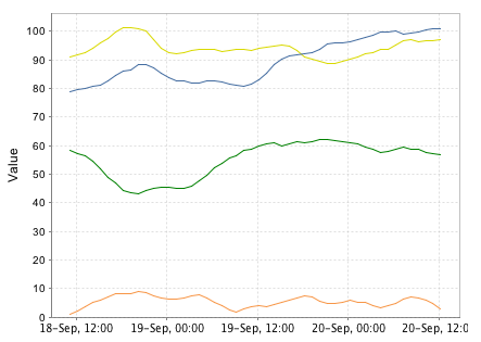
Example Time Series Chart
Usage
To use the chart, drag the component from the Report Palette to your report. Type or drag a data key from the key browser into the Data Key field of the Chart Options Config. Select a time series domain (for example a t_series column of your query). The Y axis (value) can be modified in the property inspector but the X axis (time range) is based on the data in the 'data key' that powers the chart dataset.
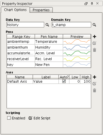
Timeseries Chart Config Panel
To add pens to your query, simply click the  button on the Configure Chart panel of the property inspector. Double clicking or selecting a pen then clicking the
  button will toggle the Pen Configuration area.
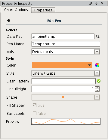
Pen Configuration