Component Properties
Every Component Has Properties
Each component has a unique set of properties. A property is simply a named variable with a distinct type that affects something about the component's behavior or appearance. Hover your mouse over the property in the Property Editor panel to see its data type and scripting name.
Every component in Ignition comes with its own unique set of properties by default, which convey important information. Each component you select inside a window has various properties that you can set and modify in the Property Editor. These properties dictate how a component looks and behaves inside of a window. You can also create your own custom properties for you particular use. It is possible to extend this list pf properties by adding our own custom properties to the component. Basically it's like adding variables to the component that we work with in the screen.
The Property Editor
The Property Editor is a dockable panel that appears in the Designer's central workspace, usually in the lower left corner. It displays the properties of the selected component. If more than one component is selected, it will show all properties that the current selection set have in common.
Filters
It is common for components to have many properties, so by default, the Property Editor only shows the basic properties. These are the properties that you'll most commonly want to set or bind for a given component. There are also the standard properties. This is a larger set of properties that includes the basic properties and many other useful properties. Some properties are expert properties. These are properties that are either uncommon to set or whose purpose might require an in-depth understanding of the inner-workings of the component. You can change the filter using the filter button (  ) in the Property Editor's toolbar.
Note: When you first open the designer, the property editor is set to only show basic properties. To see all of them, change the property filter to All.
Status Indication
The name of a property in the Property Editor conveys important information about that property:
-
A blue name indicates that the property is a custom property.
-
A bold name with a link icon
 indicates that the property is bound usin
g a property binding.
indicates that the property is bound usin
g a property binding.
-
A bold name with a color palette icon
 indicates that the property is being affected by the component styles settings.
 -
A red bold name with
 a warning icon indicates that the property is double-bound. This means that two things, a property binding and the styles settings are both trying to drive the property value. This is almost assuredly a mistake.
The Binding Button
To the right of most properties is the binding button (  ). Use this button to modify the property binding that is driving that property. You can only use this button when the window workspace is not in preview mode. Some properties cannot be bound because their datatype is not supported by the binding system. You can still use scripting to affect these properties.
Data Types
There are a wide variety of datatypes across all of the Vision Module's components. Each property has a distinct type. Here are the most common types that you'll find on the Property Editor.
Numeric Types |
|
|
Boolean |
A true/false value. Modeled as 0/1 in Python. Technically, 0 is false and anything else is true. |
|
Short |
A 16-bit signed integer. Can hold values between -215 and 215-1. That's -32,768 to 32,767, inclusive. |
|
Integer/int |
A 32-bit signed integer. Can hold values between -231 and 231-1. That's -2,147,483,648 to 2,147,483,647 inclusive. |
|
Long |
A 64-bit signed integer. Can hold values between -263 and 263-1. That's -9,223,372,036,854,775,808 to 9,223,372,036,854,775,807 inclusive. |
|
Float |
A 32-bit signed floating point number in IEEE 754 format. |
|
Double |
A 64-bit signed floating point number in IEEE 754 format. |
Non-Numeric Types |
|
|
String |
A string of characters. Uses UTF-16 format internally to represent the characters. |
|
Color |
A color, in the RGBA color space. Colors can easily be made dynamic or animated using Property Bindings or Styles. |
|
Date |
Represents a point it time with millisecond precision. Internally stored as the number of milliseconds that have passed since the "epoch", Jan 1st 1970, 00:00:00 UTC. |
|
Dataset |
A complex data structure that closely mimics the structure of a database table. A Dataset is a two-dimensional matrix (also known as a table) of data organized in columns and rows. Each column has a name and a datatype. |
|
Font |
A typeface. Each typeface has a name, size, and style. |
|
Border |
A component border is a visual decoration around the component's edges. You can make a border dynamic by using Styles, the toBorder() expression function, or Java scripting. |
What is the difference between Integer vs. Int?
The difference is that an Integer property will accept the special null (or None in Python-speak) value, while an int property will not. This distinction holds true for all of the numeric types: the type name that starts with a capital letter accepts null, while the all-lowercase version does not.
Expert Tip!
Most of these datatypes are actually defined by Java. For example, the Date datatype is really an instance of a java.util.Date. This means that you can use the java.util.Calendar class to manipulate them, and the java.text.SimpleDateFormat class to format and parse them. Learn more about these classes in the Java 2 Platform online documentation at http://java.sun.com/j2se/1.5.0/docs/api/index.html
See also: Working with Different Datatypes
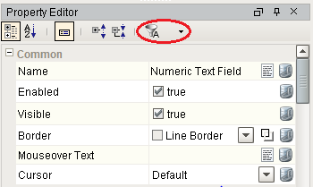
Common Properties
Every component has properties arranged into groups based on what his has available. IE: Common, Data, Appearance, etc. Each component has a different list of properties to effect how it behaves, but every component has the Common group or properties at the top.
These Common properties will behave the same for all components. Here's a list for each property and when it might be used.
Name
The name of the component. This string is used to identify your components in the Project Browser. This is especially important for Bindings and Scripting. Binding is allowed on this property but it is recommended to never bind this property. Binding it can break your scripts, bindings, and cause errors.
Enabled
This Boolean controls whether a component can be interacted with. Most commonly used with data entry components to allow the user to see the value but not change it.
Visible
This Boolean controls whether the component is shown on the window. You can bind this property to show/hide the component based on any logic you want. IE: security, process step, etc.
Border
The border that surrounds the component. There is a dropdown to select from a list of common borders, and a button to the right to manually edit a border from several different options with a second tab that shows Titled Borders. When binding this property, note that this is a complex data type. It is a Java Border data type, not a string or an enumeration. The common ways to make this property dynamic are to bind it with an Expression binding type or to set it through a script, but using the Expression binding is preferred. If you are using an Expression binding, you must use the toBorder() expression function to return the correct data type. If you are using a script, you need to make sure you use the Java Border data type. See the Java documentation for more information on setting a border through scripting.
Mouseover Text
The text that is displayed when a user moves the mouse over the component. This string is commonly used to provide your operators more information about an object. IE: showing the PLC address of an on-screen value, or telling the operator exactly what will happen when a button is pressed. HTML is allowed in this property.
Cursor
The mouse pointer image to use when the operator moves the mouse over the component. This int property corresponds to one of the options in the list. Selecting 'default' means the operating system decides what pointer to use.
|
Value |
Cursor |
|
0 |
Default |
|
1 |
Crosshair |
|
2 |
Text |
|
3 |
Wait |
|
4 |
SW Resize |
|
5 |
SE Resize |
|
6 |
NW Resize |
|
7 |
NE Resize |
|
8 |
N Resize |
|
9 |
S Resize |
|
10 |
W Resize |
|
11 |
E Resize |
|
12 |
Hand |
|
13 |
Move |
Similar Topics ...