Table Header, Details and Summary Rows
Rows are an important fundamental aspect of tables. The different types of rows can be independently enabled for each level of Grouping, and for each table in a Table Group. Adding or removing rows is as simple as selecting the Row boxes in the Table Configuration tab of the Property Inspector. Additionally, Table Row Versioning gives you the option of conditionally displaying rows with a different format
Row Types
Header Row
The header row is used to add such report features as column labels. An interesting feature of the header is Reprint When Wrapped, which allows a different header on every page after the first. The main data in a table has one header row. Each subgroup of data can have its own row header.
With grouping, the "top" level Header is the first row for the entire report. Lower level Headers fall immediately below higher level Details. In many cases where one is used, the other could be used equivalently in its case.
Detail Rows
The detail rows typically represent the majority of the data on a table or the "middle" rows. You might disable detail rows in unusual situations such as only displaying aggregate summaries in a grouped report. With grouping, the Detail rows appear below the same level Header and above the Header of the next level.
Summary Row
The summary row works like the header row. It prints at the bottom of the table. With grouping, Summary rows are always last, always in the opposite order of the Headers.
Row Configuration
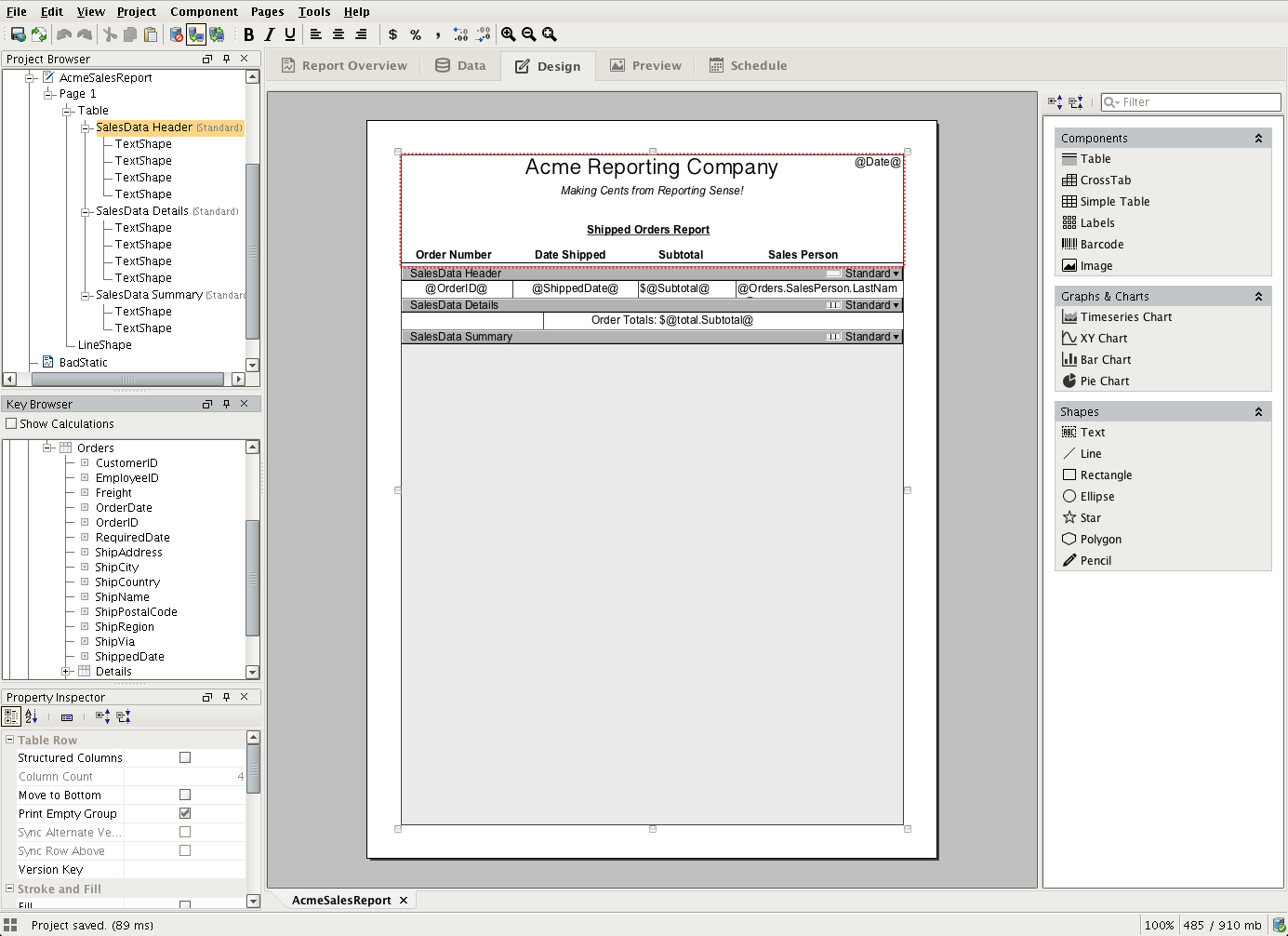
Configuring rows is easy with just a little know-how. Rows are best understood with a simple example, so we'll reference the design table on the right as an example.
To begin making changes to a row, you first need to select the row you'd like to modify by clicking the row on the component or the selecting the row's node in the Project Browser tree. In the image, the Header row has been selected. We can tell by looking at the Project Browser tree, or by looking at the red outline of the fields above where it says SalesData Header (the row's content is laid out above its respective row bar).
The four text fields that are above the Details row comprise what we call a Structured Row. A structured row can have a variable number of fields, and can be configured in the Properties tab of the component's Property Inspector panel. To view the properties of our Details row (or any row), we will first need to super-select the row by clicking on the dark bar in the component or the "Details" node in the Project Browser. We can confirm that this row is structured by looking at the Property table for the "Structured Columns" checkbox, or by looking for the Jail Bars  icon next to the row version label for the Standard row version.
Structured rows can provide more control over the layout, wrapping, and organization of your text based table data. Since structured rows are intended for text layouts, they can not contain things like images and barcodes. To embed things like images and charts, we'll want to use Unstructured Rows. An unstructured row is functionally very similar to structured rows, except that it doesn't offer the same column based text constraints. The header of the image shows an example of using an unstructured row. In this case, we have added multiple Text shapes to add our logo, a title, and the a date Key in the corner to add the date every time a report is executed. A Line shape was used to underline our column headers, which are also in a Text shape.
We can alter between Structured and Unstructured rows in the Properties tab when the desired row is selected, or by clicking the white box on the row we'd like to toggle.