XY Chart
The  is will generate an X vs Y plot of your data. XY charts can have multiple Pens and Axes per data source, each easily configurable in the custom configuration panel for the component.
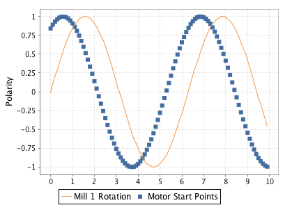
Example XY Chart
Usage
To use the chart, drag the component from the Report Palette to your report. Type or drag a data key from the key browser into the Data Key field of the Chart Options Config. Select a time series domain (for example a t_series column of your query).
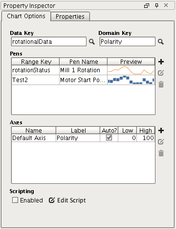
XY Chart Configuration Panel
To add pens to your query, simply click the  button on the Configure Chart panel of the property inspector. Double clicking or selecting a pen then clicking the
  button will toggle the Pen Configuration area.
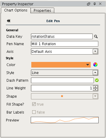
XY Chart Pen Configuration