Report Charts
Report Charts
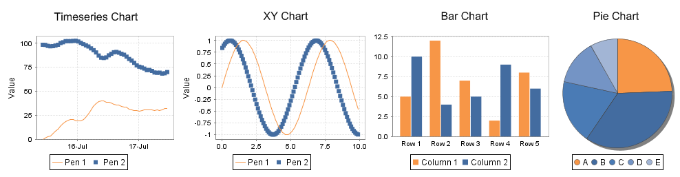
Report charts allow you to display your data in a graphical way, just like the charts in the rest of Ignition. Charts can be driven by any data source in a report, or even embedded into table rows using nested data sets. There are four types of charts so you can show the data any way you like.
-
Timeseries Chart: a simple chart that plots values against a timestamp X axis. Great for showing historical trending.
-
XY Chart: similar to the Timeseries chart, this chart plots lines on X-Y axes, but is configured to show numeric categores on the X axis.
-
Bar Chart: a bar chart that uses text categories on the X axis. Can be configured as a Pareto chart.
-
Pie Chart: a basic pie chart that uses text categories. Percentages are automatically calculated.
In This Section ...