Working with Components
Selecting Components
There are a number of different ways to select components within a window, each of which have their own advantages.
Mouse Selection
Using the mouse is the most common way to select components. Make sure that the selection tool (  ) is the active tool. Simply click on a component to select it. If the component you want to select is obscured by other components, hold-down Alt and keep clicking, the selection will step down through the z-order.
You can also select components using window-selection. Click-and-drag in a container to draw a selection rectangle. If you drag the window left-to-right, it will select all components that are completely contained within the rectangle. If you drag the window right-to-left, it will select all components that the rectangle touches. Lastly, you can start dragging a window selection and then hold-down the Alt key to use touch selection. This will draw a line as you drag, and any components that the line touches will become selected. As you're using these techniques, components that are about to become selected will be given a yellow highlight border.
Tree Selection
By selecting nodes in the Project Browser tree you can manipulate the current selection. This is a handy way to select the current window itself, which is hard to click on since it is behind the Root container. However, you can click to it, using Alt-click to step down through the z-order. It is also the only way to select components that are invisible.
Manipulating Components
Manipulating components can be done with both the mouse and the keyboard. You can move components around, resize them, and rotate them.
Resizing
When you select the component you want to resize, they'll get 8 resize-handles displayed around the edge of the selection. These handles look like double-sided arrows around the perimeter. Use the mouse to drag them to change the size of the components in the selection. To maintain the selection's aspect ratio, hold down Ctrl as you resize. To resize around the center of the current selection, hold down Shift. These can be used at the same time.
You can also resize the current selection using the keyboard. To nudge the right or bottom edge of the selection in or out, use Shift combined with the arrow keys. To nudge the top or left edge of the selection, use Ctrl-Shift combined with arrow keys. These nudge actions will resize one pixel at a time. To resize faster, add the Alt key.
Moving
To move the component, simply drag it anywhere within the container's bounds. You can also move whatever is currently selected by holding down Alt while dragging, regardless of whether or not the mouse is over the current selection. This is important because it is the primary way to move a Container component. (Normally, dragging in a container draws a selection rectangle inside that container).
While a component is selected, you may also use the keyboard's arrow keys to move a component around. The arrow keys will move the selection one pixel at a time. Just like resizing with the arrow keys, to move faster, add the Alt key.
Duplicating
Components can be easily duplicated by dragging them as if you were going to move them and holding down the Ctrl key. This will drop a copy of the component at the desired drop location. It is often useful to also hold down Shift as you do this to ensure exact alignment. You may also use the Ctrl-D shortcut to quickly duplicate a component in place.
Rotating
Shapes can be rotated directly using the selection tool. Other components cannot be rotated in this manner. To rotate a shape, first select it using the selection tool so that you see the resize handles around it. Then simply click on it once again and you'll see the rotation handles appear. Clicking (but not double-clicking) on selected shapes toggles back and forth between the resize handles and the rotation handles.
Once you see the rotation handles, simply start dragging one to rotate the shape or shapes. Holding down the Ctrl key will snap your rotation movements to 15° increments. When the rotation handles are present, there is also a small red crosshair handle that starts in the middle of the selection. This is the rotation anchor: the point that the selection will rotate around. You can drag it anywhere you'd like to rotate around a point other than the center of the shape.
See also: Component Animation
Component Grouping
Shapes and components can be grouped together so that they act like a single component in the Designer. Grouping components is very similar to putting them in a Container. In fact, it is the same thing as cutting and pasting them into a perfectly-sized container and then putting that container into group mode, with one exception. If the group contains only shapes and no other kinds of components, it will be a special shape-group that has the ability to be rotated and has some other shape-like properties.
When components or shapes are in a group, clicking on them in the Designer will select the group instead of the shape. If you double-click on a group, it will become "super-selected", which will allow you to interact with its contents until you select something outside of that group.
Layout works differently for groups. The layout setting for components and shapes inside a group is ignored. All members of a group act as if they are in relative layout with no aspect ratio restrictions. This special group-layout mode is also active when resizing a group inside of the Designer, whereas traditional layout doesn't take effect in the Designer.
Groups can contain other groups, creating a nested structure. Groups themselves are also components, meaning that you can add custom properties to groups, bind them, and so on.
Component Layout
Layout is the concept that a component's size and position, relative to its parent container's size and position, can be dynamic. This allows the creation of windows that resize gracefully using either Anchored or Relative layouts and can optionally keep the original aspect ratio.
This is a very important concept because of the web-launched deployment of Vision clients - they often end up being launched on many different monitors with many different resolutions.
This is also important for components that have user-adjustable windows like popup windows. Imagine a popup window that is mostly displaying a large table or chart. If you're running on a large monitor, you may want to make the window bigger to see the table or chart easier. Of course, this is only useful if the table or chart actually gets larger with the window.
Changing a component's layout is as simple as right-clicking on the component and opening the Layout dialog box. You can also alter the default layout mode that gets assigned to new components. See Designer/Window Editing Properties.
Relative vs Anchored Layout
There are two layout modes, and they are set on a per-component basis. Both affect the component's size and position relative to its parent container. The root container's size is dictated by the window size. To edit the layout of a component, right-click on the component and select Layout from the menu. the Layout Constraints window displays showing all the default settings. These default settings can be altered in the Project Properties.
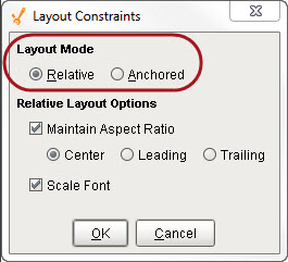
Layout Modes
-
Relative
This mode makes a component's size and location relative to its parent's size and location. When the parent changes size, the component changes accordingly. This creates components that auto-scale. -
Anchored
This mode makes the edge of a component's two axes (horizontal and vertical) anchored to the edge or edges of its parent.
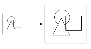
Relative Layout
Relative layout is the default mode. This is a simple and effective layout mode that simply keeps a component's size and position constant relative to its parent container, even when the parent container grows or shrinks. More precisely, it remembers the component's position and size as a percentage of its parent's bounds at the last time the window was saved. Relative layout also has the option of scaling a component's font appropriately.
Example of Relative Layout
Note that relative layout mode respects aspect ratio. So if the parent component is distorted, the contents will not be. The extra space is distributed evenly on both sides of the contents.
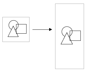
Relative layout preserves aspect ratio
Relative Layout Options
-
Maintain Aspect Ratio
If selected, the component's original aspect ratio is preserved. Otherwise, it can stretch tall or wide. -
Center
When maintaining the aspect ratio, centers the component with respect to its parent. -
Leading
When maintaining the aspect ratio, aligns the component with the paper leading edge. -
Trailing
When maintaining the aspect ratio, aligns the component with the parent's trailing edge. -
Scale Font
If selected, the component's font will scale along with its size as the relative layout adjusts the component. This will override other font size settings. If this setting is applied to a Group, then all components in the group will use this setting.
Anchored Layout
Anchored layout lets you specify various "anchors" for the component. The anchors dictate how far each of the 4 edges of the component stay from their corresponding edges in the parent container. For example, if you anchor top and left, then your component will stay a constant distance from top and left edges of its parent. Since you didn't specify an anchor for the right or bottom sides, they won't be affected by the layout.
Components anchored top and left
If you anchor bottom and right instead, the components will again stay the same size (since you didn't specify an anchor for their other edges, but they will stay a constant distance from their parent's right and bottom edges.
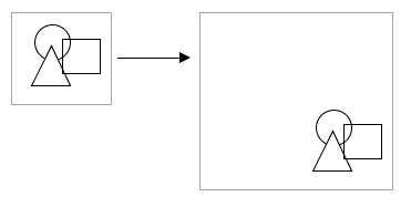
Components anchored bottom and right
Anchored Layout Options
-
North/South
If one of these is selected, the distance between that edge of the component and that edge of the container is preserved. If both are selected, the component will stretch its height to maintain both distances. -
West/East
If one of these is selected, the distance between that edge of the component and that edge of the container is preserved. If both are selected, the component will stretch its width to maintain both distances. -
Center Vertically
When selected, both top and bottom buttons will be deselected. This option maintains the height of the component and centers it vertically in the container. -
Center Horizontally
When selected, both left and right buttons will be deselected. This option maintains the width of the component and centers it horizontally in the container.
Of course, you can mix and match the various modes for the different components in a given container. The following image shows the following:
-
The square uses a horizontal and vertical centering anchor. It is centered, and stays the same size.
-
The triangle is anchored south and west.
-
The circle is anchored north, west, south, and east. This means that its edges are all anchored and stay a fixed distance to each of its parent's edges, so it grows.
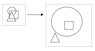
Components with various anchoring modes
Client Minimum Size
Clients can define a minimum size, because even with dynamic layout, you usually don't want the client to get too small. This is because it would become unusable and unreadable. This is what the Minimum Size property is for. By default it is set to 800x600, but you can adjust it. For more information, see Client/User Interface Properties.
Similar Topics ...