Creating Components
Adding Components to a Window
There are four primary methods for creating components:
-
Select the component in the palette, and then use the mouse to draw a rectangle in a container. While a component is selected in a palette, the mouse curser will be a crosshair (+) when hovering over a container that the component can be dropped in. Draw a rectangle in the container to specify where the component should be placed and what size it should be.
-
Drag a component's icon from a palette onto a container. The component will be placed where you dropped it at its default size. It can then be resized.
-
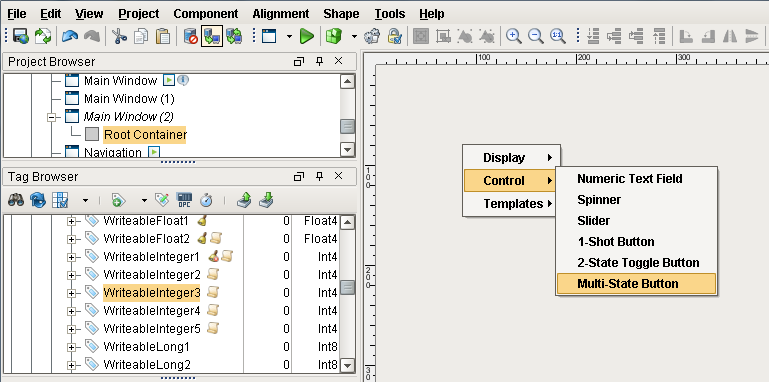
Drag one or more Tags onto a window. You'll get a popup with the kind of component you want to make based on the Tag type.
-
Any shapes that are drawn with the drawing tools, any imported images or SVGs, and any of the Symbol Factory images are also considered components.
Choosing the Component Palette
There are two styles of component palette in Ignition Vision: the tabbed palette and the collapsible palette. These palettes work in the same way, but the tabbed palette is meant to dock to the north or south edge of the workspace, and the collapsible palette is meant to dock to the east or west edge. By default, the Collapsible palette is visible in the window workspace. To switch palettes, navigate to the View > Panels menu, and select the Tabbed Palette or the Collapsible Palette.
Creating a Custom Palettes
Custom palettes are like expanded copy/paste clipboards. You can put customized components or groups of components into a palette for quick access.
To create a custom palette, right-click on a tab in the tabbed palette or a header in the collapsible palette, and choose New Custom Palette. Your custom palette will appear as the last palette. Your custom palette has one special button in it, the capture button (  ). To add components to your palette, select them and press the capture button. This effectively does a copy, and stores the captured components as a new item in the clipboard. You can then use that item much like a normal component, and add multiple copies of it to your windows.
Note that these are simple copies, and are not linked back to the custom palette. Re-capturing that palette item will not update all uses of that item across your windows.
Creating Components using Tags
Components can also be created by simply dragging a tag onto a container. Depending on the datatype of the Tag, you will get a popup menu prompting you to select an appropriate type of component for that Tag. This technique is great for rapid application design as it does two things for you:
-
The component is created at the position you dropped it.
-
A variety of property bindings are created automatically.
Tags are used in windows to power property bindings on components. The easiest way to make some components that are bound to Tags is to simply drag and drop some Tags onto your window. If you don't have Tags yet, see the Browsing and Creating OPC Tags page for more info.
-
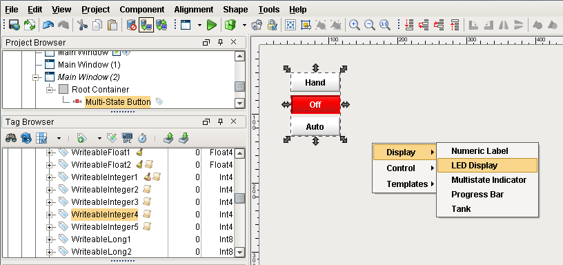
Drag a Tag onto a window. You'll get a popup menu asking you what kind of component to make. You can Display the Tag with some components, and control the Tag with other components.
-
Drag a few more Tags onto the screen to experiment with the different options.
-
As you're editing your project, you can click the Save icon on the toolbar to save your changes. Note that unless you started with a new blank project (not one of the project templates) your new window won't be available in the client after saving it. Any new window must be opened, and that means adding a button somewhere to open/swap to this window. See Navigation Windows for more information.
For example, suppose you have an Int4 type Tag, if you drag the tag from the Tag Browser panel onto a component, you will be prompted either to display or control the Tag with a variety of labels, level indicators, numeric entry fields, and control buttons.
The bindings depend on what kind of tag was dropped and what kind of component was created. For example, lets suppose you have a Float8 point that represents a setpoint, and you want to set it. Drop the Tag onto a container and choose to control it with a Numeric Text Field. The following bindings will be set up automatically:
-
The text field's doubleValue property gets a bidirectional tag binding to the tag's Value property.
-
The text field's minimum and maximum properties get tag bindings to the tag's EngLow and EngHigh properties, respectively.
-
The text field's decimalFormat property gets a tag binding to the tag's FormatString property.
-
The text field's toolTipText property gets a tag binding to the tag's Tooltip property.
It is important to realize that multiple property bindings are created when creating components this way. These bindings not only using the tag's value, but much of the tag's metadata as well. Using the tags metadata in this way can greatly improve a project's maintainability. For example, if you decide that the setpoint needs 3 decimal places of precision, you can simply alter the tag's FormatString to be #,##0.000, and anywhere you used that tag will start displaying the correct precision because of the metadata bindings.
See also: Property Binding , Tag Metadata Properties
Creating Components using Shapes
All of the shapes that you can draw using the shape tools are themselves components. As such, they have properties, event handlers, names, layout constraints, and all of the other things that you'll find on other components. They also have some things that normal components don't.
Binding Shape Position
One such thing that shapes have that normal components don't is a set of properties that control their location. These properties are called relX, relY, relHeight, and relWidth. The "rel" prefix stands for "relative". This comes from the fact that the values of these properties are always treated as relative to the shape's parent container's width and height, even in a running Client where that container may be a wildly different size due to the layout mechanism.
For example, let's say that you have a shape that is located at x=100, y=100, and was 125 by 125 inside a container that is 500 by 500. If you want to animate that shape so that it moves back and forth across the screen, you'd set up a binding so that relX changed from 0 to 375. (You want X to max out at 375 so that the right-edge of the 125px wide shape aligns with the right edge of the 500px
container).
Now, at runtime, that container might be 1000 by 1000 on a user's large monitor. By binding relX to go between 0 and 375, the true X value of your shape (whose width will now be 250px due to the relative layout system), will correctly move between 0 and 1750, giving you the same effect that you planned for in the Designer.
Long story short, using the rel* properties let you animate the shape using bindings and not worry about the details of the layout system and how they'll resize the coordinates at runtime.
Binding Rotation
Another ability unique to shapes is the ability to be rotated. Simply click on a selected shape and the resize controls become rotate controls. There's even a rotation property that can be edited directly or bound to something dynamic like a tag.
Binding the rotation comes with one big warning: observe that when you change a shape's rotation, its position also changes. The position of any shape is the top-leftmost corner of the rectangle that completely encloses the shape.
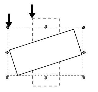
Rotating the shape dramatically changes its position
Because of this effect, if you wish to both dynamically rotate and move a component, special care must be taken since rotation alters the position. You don't want your position binding and the rotation binding both fighting over the position of the component. The way to both rotate and move a shape is as follows:
-
Bind the rotation on your shape as you wish.
-
Create a shape (for example, a rectangle) that completely encloses (in other words, it's bigger than) your shape at any rotation angle.
-
Set that rectangle's visible property to false.
-
Select your shape and the rectangle and group them.
-
Bind the position on the resulting group.
If you follow these steps you can animate both the rotation and position of a shape.
Similar Topics ...