Fill and Stroke
All shapes have three properties that affect how they look: Fill Paint, Stroke Paint, and Stroke Style.
-
Fill Paint is a property of type Paint that represents the interior or fill color of the shape.
-
Stroke Paint property (also a Paint) represents the color of the shape's outline.
-
Stoke Style property is a property of type Stroke that affects the thickness, corners, and dash properties of the shape's outline.
Fill Paint
Editing Paints
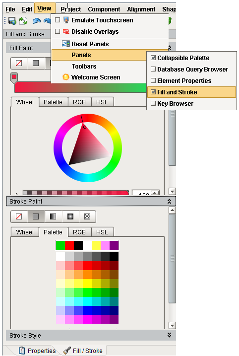
Both the Fill and Stroke paints can be a variety of different types of paints. To edit a shape's fill or stroke paint, you can either use the paint dropdown in the Property Editor table by clicking on the pencil icon (  ) or open up the dedicated Fill and Stroke panel from the View menu.
Property Editor Table using the Pencil
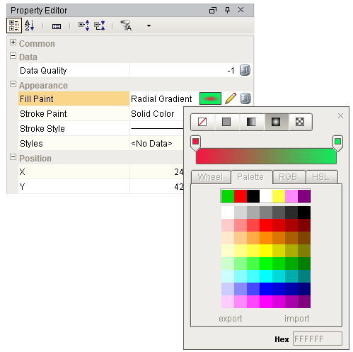
Fill and Stroke Panel from the View Menu
Paint Types
The top of the paint editor is a selection area that allows you to choose between the five different types of paints.
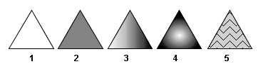
The five different paint types demonstrated as triangle full paoints.
-
No Paint (
 ). If used as a fill paint, then the interior of the shape will be transparent. If used as the stroke paint, then the paint's outline will not be drawn at.
 -
Solid Color Paint (
 ). This paint type is equivalent to the Color type used elsewhere throughout the component library. A solid color is any color, including an alpha (transparency) level.
 -
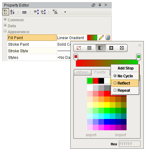
Linear gradient (
 ). Linear gradients smoothly blend any number of colors along a straight line across the shape. Each color is called a Stop. Each stop is represented as a drag-able control on a horizontal preview of the gradient in the gradient editor. You can click on a stop to select it and change its color or drag it to reposition it. You can right-click on it to remove it. You can right-click on the preview strip to add new stops and change the gradient's cycle mode.
 -
Radial gradient (
 ). Radial paints are very much like linear paints except that the colors emanate from a point creating an ellipse of each hue. Radial paints are configured in the same way as linear paints.
 -
Pattern paint (
 ). This paint uses a repeating pixel-pattern with two different colors. You can pick a pattern from the dropdown or create your own using the built-in pattern editor.
Gradients
Gradient Paint Bounds
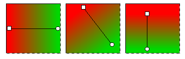
The two gradient paints, Linear and Radial, are more than a list of colored stops, they also need to be placed relative to the shape. The same gradient may look wildly different depending on how it is placed against the shape. By default, a Linear gradient will run horizontally across the width of the entire shape, but this is readily changed. By switching to the Gradient Tool (  ) located on the drawing tools toolbar, you can drag handles around to change the orientation of the gradient. You can even make the gradient larger or smaller depending on how big you want it to be.
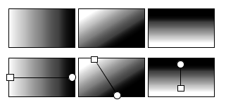
The same gradient, applied differently to the same shape.
Gradient Cycles
The two gradient paints (Linear and Radial) both have a cycle mode that you can change by right-clicking within the preview strip.
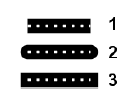
The cycle modes are illustrated below: No Cycle, Reflect, and Repeat.
-
No Cycle - The first and last stops are repeated forever after the edge of the gradient bounds.
-
Reflect - Beyond the bounds of the gradient, it will be reflected and drawn in reverse, and then reflected again, creating a smooth repetition.
-
Repeat - Beyond the bounds of the gradient, it will be repeated forever.
To set a gradient
-
In the Designer, select your component.
-
In the Property Editor under Appearance, click the Pencil icon, and then right click within the Preview Strip.
-
Select either the Linear or Radial gradient.
-
You will see two stops: white and black. You can click on each Stop and choose a different color.
-
You can also add / remove Stops, and select your desired cycle: No Cycle, Reflect or Repeat.
-
With your component still selected on your window, and click the Gradient tool in the toolbar. You'll notice a line on your component. Now, you can drag the line's handles to change the orientation and lengthen or shorten the gradient.
-
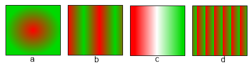
Here are a few examples of what you can do with gradients:
-
Radial - No cycle
-
Linear - Reflective
-
Linear - with a 3rd Stop
-
Linear - Repeat
-
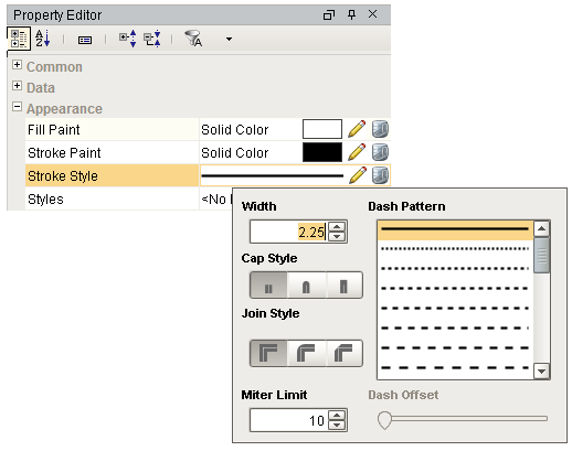
Stroke Style
A shape's stroke paint is only half the story. The Stroke Style is also an important component of how an outline is drawn. Primarily the style controls the thickness of the line drawn, but it also can be used to create a dashed line. The setting for thickness is specified in pixels, and creating a dashed line is as easy as picking the style from the list. The effect of the thickness and dash pattern settings is fairly self-explanatory, but the other stroke settings are a bit more subtle. You can notice their effect more readily on thick lines.
You can access the Stroke Style in the Property Editor under
Appearance
.
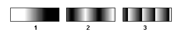
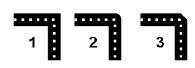
Cap style is a setting that controls what happens at the end of a line segment. You can either have the line simply be terminated with no decoration (#1), round-off the end with a semi-circle (#2), or cap the end with a square (#3).
Cap styles
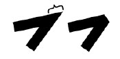
Join style is a setting that affects how a line is drawn where two segments meet (a corner). The default setting is called a miter join (#1), where the stroke is extended into a point to make a sharp corner. The other options are rounded corners (#2) or beveled edge corners (#3).
Join styles
Miter Limit style joins can become a problem for very sharp angles. With a sufficiently sharp angle, the miter decoration can become extremely long. To control this, there is a miter length setting to limit the length of a miter decoration. The illustration on the left shows the same miter join with two different miter length settings. The first drawing illustrates the length of the miter join.
Miter length illustrated
Similar Topics ...