Understanding Components
About Components
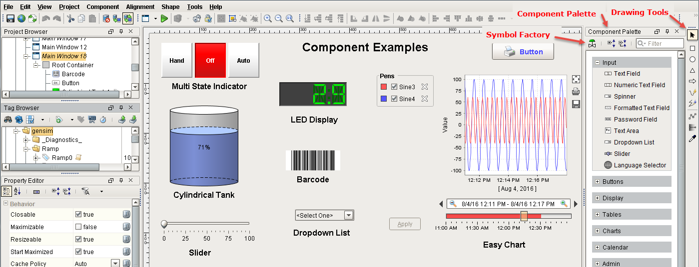
Components are the visual elements that what fill up your windows with useful content. Anyone familiar with computers should already understand the basic concept of a component. They are the widgets that you deal with every day, such as: buttons, text areas, dropdowns, charts, and so on. The Vision module comes with a host of useful components out of the box, many of which are specialized for industrial controls use. Other modules, like the Reporting module, add more components for specialty purposes.
To make components do something useful, like display dynamic information or control a device register, you configure property bindings for the component. To add scripting actions to a component, you configure event handlers for it.
Configuring components is the bulk of the designer's work when designing a Vision project. The basic workflow is to take a component from the palette and drop it into a container on a window. From there, you can use the mouse to drag and resize the component into the correct position. While the component is selected, you can use the Property Editor panel to alter the component's properties, which changes the component's appearance and behavior.
Components
In Designer, there is a component palette filled with different types of components that you can drag and drop into your workspace. There are several component types that include Input, Display, Table, Chart, Calendar, Alarming, Reporting components, and more.
Shapes
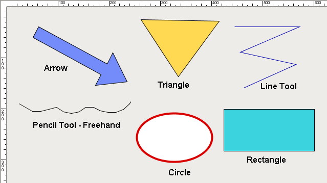
There are also drawing tools provided so you can create your own components from shapes such as lines, rectangles, circles, and arrows, to name a few. Shapes are components too. Each shape may be individually selected, named, and has its own properties. Shapes have some additional capabilities that other components don't have, such as the ability to be rotated. Shapes are created using the shape drawing tools, not dragged from the component palette.
Symbol Factory
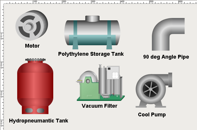
You can even import Scalable Vector Graphics (SVGs) into a window. Symbol Factory, which is a separate module, contains a variety of 4,000 industrial symbols to choose from for your projects. The Symbol Factory includes symbols for Motors, Tanks, Chemical, HAVC, Food, Material Handling, and many more. Just like components, they can be dragged and dropped on your screen, resized, and you can even add color to the individual component's pieces. Your own SVG's can even be imported directly into a window to use in your project.
Images
Ignition also comes with a host of images to use on your components such as PNGs, JPGs, and GIFs. They can spice up a plain button, header, label and more. In addition to the images that come with Ignition, you can import your own too.
Creating Components
Even with all the different component types, creating components in your windows is super easy! All the components are on your component palette; components, shapes, and if installed, Symbol Factory. There are three ways to create components:
-
Select your component on the component palette, and use the mouse to draw a rectangle in your workspace where you want your component to be located. When you release the mouse, the component will drop in. It can then be resized, moved or rotated.
-
Drag a component's icon from the palette onto a container. The component will be placed where you drop it at it's default size. Then, it can be resized, moved, or rotated if desired.
-
The easiest way to make some components that are bound to tags is to simply drag and drop some Tags onto your window. Drag a tag onto a window. You'll get a popup menu asking you what kind of component to make. You can display the tag with some components, and control the tag with other components.
To learn more, go to Creating Components. Once your components are in your workspace, you can move them around, resize, rotate and even group them. Component layout is a very important concept because of the web-launched deployment of Vision clients launched on many different monitors with many different resolutions. To learn about what you can do with components, refer to Manipulating Components, Component Grouping, and Component Layout sections.
Component Properties
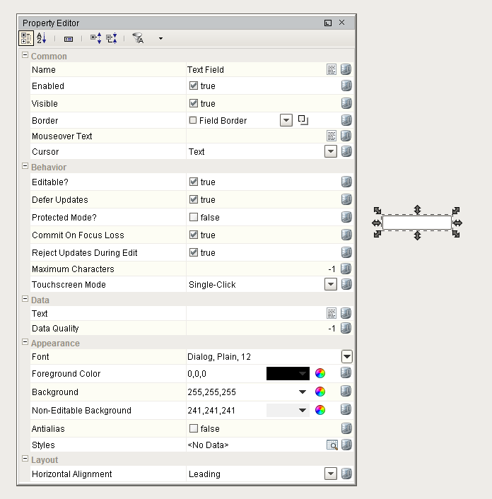
Each component has it's own set of unique properties which dictate how a component looks and behaves inside of the Ignition window. The Property Editor conveys a lot of information about a component. When you click on a component, you see all the properties that make up that component. By default, Ignition shows you all the properties broken up by categories in the Property Editor. You can view properties in alphabetical order, and filter on specific properties if you prefer. The choice is yours! Each property has a name and a data type. By clicking on the "Show/Hide Description Area" toggle or mousing over a property, you can see the description of that property along with the data type.
To make a property dynamic you are going to use the component's properties to bind them to various sources of data like a Tag, database query or to a calculation. There is binding button on the right side of each property where you can edit the property to set or modify a value, font, border, color, size, etc. When you click the bind button for the component, it will open a Binding window where you can select the source that you want to link it too. If you don't bind that property, the value will be static. If you bind the property to a source like a Tag, the value will change dynamically on the window. That's how Ignition windows come to life, through bindings!
Once you learn how to navigate the Property Editor and understand the various properties that exist for a component, then you know exactly how to configure that component in Ignition. When using a new component, it's always a good idea to scroll through the entire list of properties to see what the component has to offer.
Component Customizers
Some special purpose components have their own special Customizers . There are two basic types of customizers that most components have, and some components have a third customizer.
-
Customizers > Custom Properties - used to create additional properties to enhance existing functionality or add new functionality with data binding, scripting, etc.
-
Customizers > Styles Customizer - used to define visual styles based on a driving property, like a custom property, that you want to change based on the value of a driving property that draws attention to the user.
-
Customizers > XXX Customizer - these vary by component and have completely different functions specific to their component.
Custom Properties
The great thing about Ignition is if you can't find a property that you're looking for from the list properties for your component, then you can create it! You can add your own custom component properties for your particular use. You can bind custom properties just like any other property. You can even use custom properties to pass values between windows. Custom properties are extremely important and are used for a variety of different functions in Ignition.
Commonly, these properties are used to create dynamic (bound) values that are very easily accessible in component scripting. For example, an ID value based on the current selection in a table.
To learn how configure custom properties, go to the section on Component Customizers.
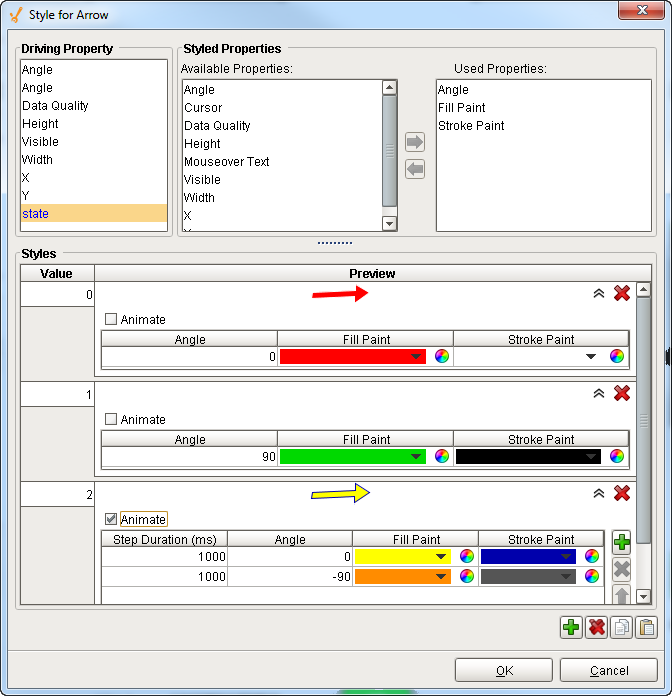
Style Customizer
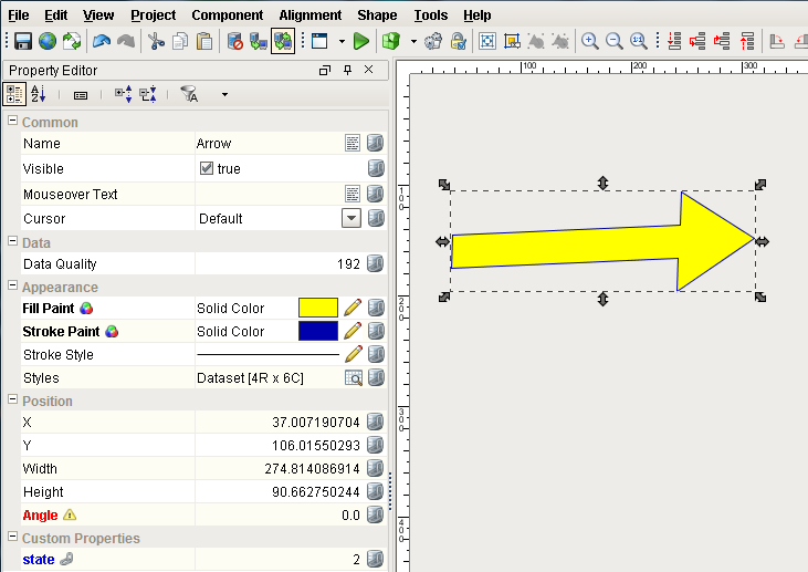
The Style Customizer is also used with many Ignition components, and lets you define a set of visual styles that are all based on a single driving property, often a custom property. For example, using the Arrow drawing tool you can change the fill paint color, stroke paint color, and angle of the component (shown below) based on a driving property called 'state.' Without styles, you would have to go to every property and bind them all individually. Some components have default styles already setup, but you can modify them however you like. If you don't like the default styles, change them! They are there to simply help you get started.
The Styles Customizer saves time when you need to bind multiple properties at once. Once you setup a style, all of the used properties appear in bold in the Property Editor. That is because technically they are bound to a style. The paint canvas icon lets you know the property is used in Styles.
Style Customizer Settings for the Arrow Component
Configured Arrow Component using Style Customizer
Special Component Customizers
Several components have their own Customizer, which is unique to specific components. You'll notice the first time you use them because they have a unique name. These special component customizers have some default settings to help you get started, but those default settings can always be modified to your requirements. The following components have their own Customizer.
-
Tables
-
Charts
-
Tab Strip
-
Multi-State Button/Indicator
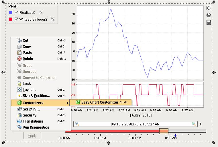
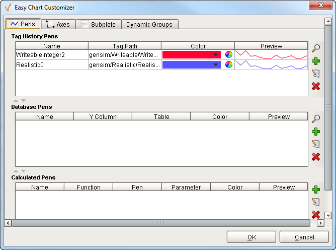
For example, when you drag and drop tags onto an Easy Chart, it automatically trends the data. Since there are many settings for each pen on an Easy Chart, it has its own Customizer so you can easily modify the chart to your own style. You can edit pen styles, create subplots, axes, and create pen groups in the Easy Chart. You can even preview it to make sure you like it.
Easy Chart Customizer
Easy Chart Customizer Window
Advanced Usage
Ignition components can be made to do some pretty sophisticated things using advanced features such as using HTML, animation, multi-line text and adding images to your components. For example, you can use HTML if you want to mix fonts or colors within the text or format multiple lines of text in a component. You can use animation with any of the SVG images and drawing tools in various ways to rotate, change the size, and change position of the component. You can even use the Image Path property to add an icon to a component to make the component visually standout.
In This Section ...