Easy Chart - Axes
This section assumes that tags and Tag History have been configured
To learn more, go to the Tag and Set up Tags to Log pages.
The examples below use OPC tags from the Generic Simulator driver, but Memory, Expression, and Query tags could be used instead.
The Easy Chart supports the use of multiple axes for displaying data from the Tag Historian. Drag your tags over from the Tag Browser to your Easy Chart that you want to display. Make sure your tags are logged in the Tag Historian. Now, let’s look at how we can configure multiple axes on an Easy Chart component.
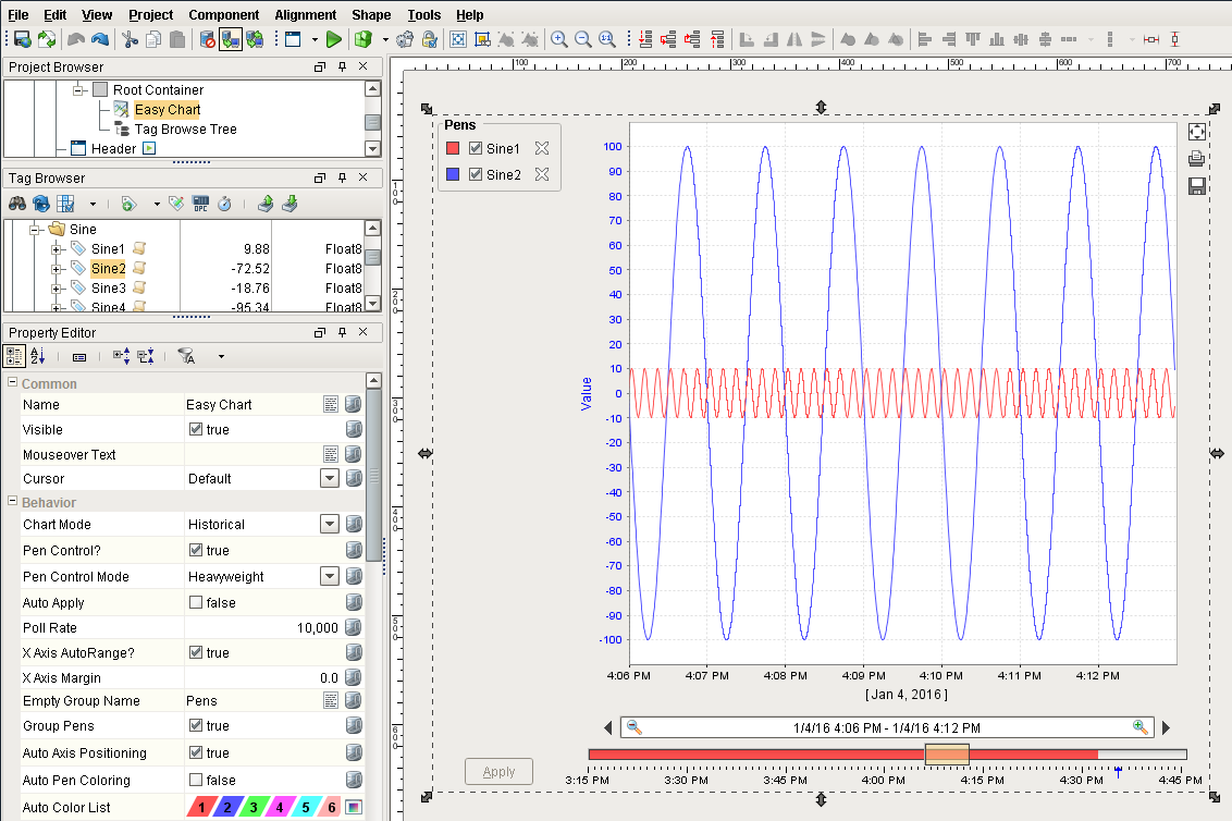
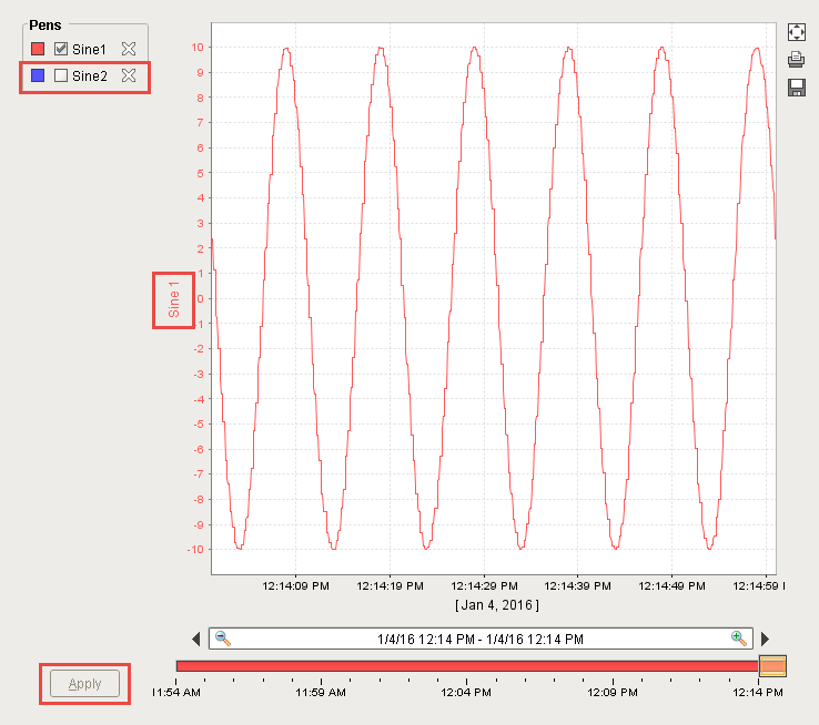
The following chart shows 2 tags: Sine 1 and Sine 2. They both have completely different value ranges. Sine 1’s values range between -10 and 10. Sine 2 values range between -100 and 100. Since both Sines are on the same axis, it is hard to see the details of Sine 1’s values since Sine 2 is throwing off the axis because of its wide range of values.
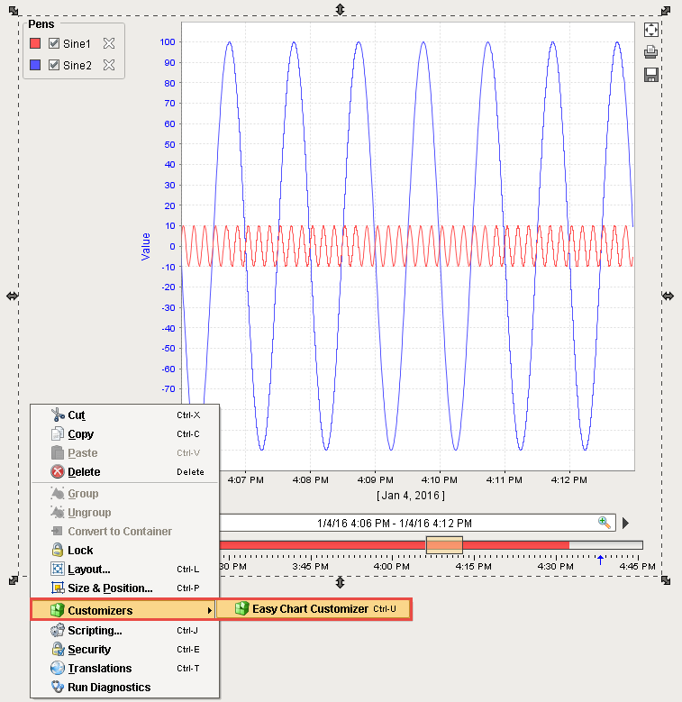
You have the option of putting your tags into different axes. You can do that in the Customizer of the Easy Chart component. Right click on the Easy Chart component and scroll down to Customizers > Easy Chart Customizer.
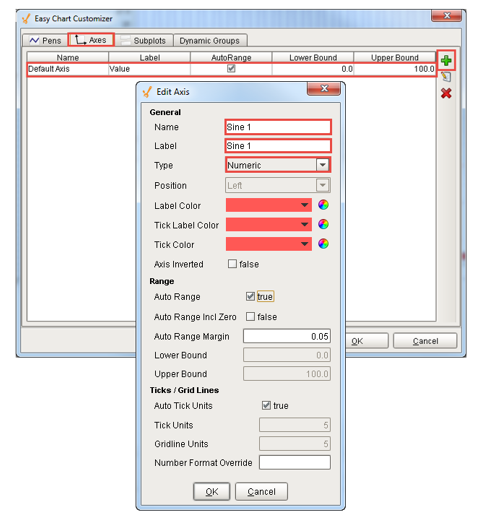
Click on the Axes tab so you can add on one or more axes to your component. There is already one axis showing called Default Axis. Both of the Sine tags are sharing the Default Axis.
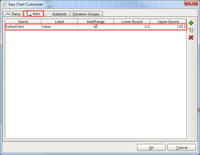
On the top right of the Easy Chart Customizer screen, click the green arrow to add a new axis. Call this Sine 1. The Label is the label name that will be displayed on your chart. Call this Sine 1 as well.
The axis can be a Numeric, Logarithmic or Symbol. Make Sine 1 a ‘Numeric.’ You can specify the colors on the Label, Tick Label and Tick Color. In this example, make them all red.
You will notice that the Position dropdown is disabled. There is an Auto Axis Positioning property in the Property Editor of the Easy Chart component that is true by default. If you turn off Auto Axis Positioning, you can then specify the left/right position of each of the axes.
You can also specify the axis Range to be Auto Range on or not. If you don’t set Auto Range, you can enter lower and upper bound values. If you set Auto Range to ‘True’, you can enter a margin value which is a plus or minus value for the top and bottom of the chart so you get a little padding. The margin value will enable you to see the entire trend so the values don’t go all the way to the very top or bottom of the chart. Set the Auto Range to ‘True’ and the Auto Range Margin to ‘0.05.’
You can set some tick units if you want and then Press OK.
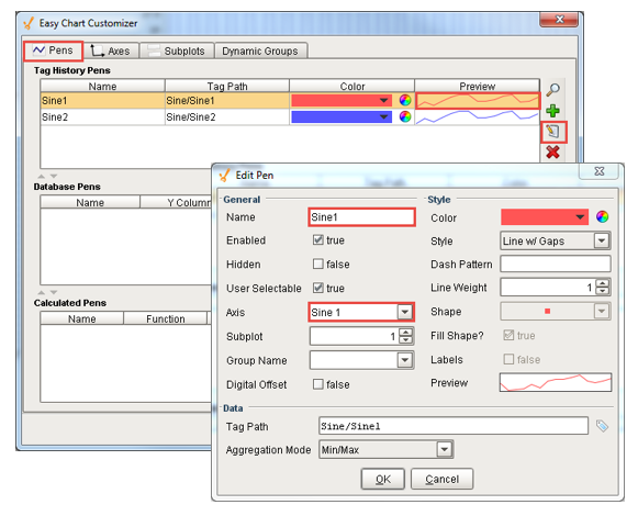
Now you have 2 axes, one for Sine 1 and another for Sine 2. Click on the Pens tab for Sine 1, select the Tag row then click the Edit Pen icon to change the Axis. Select the ‘Sine 1’ Axis from the dropdown menu and click OK.
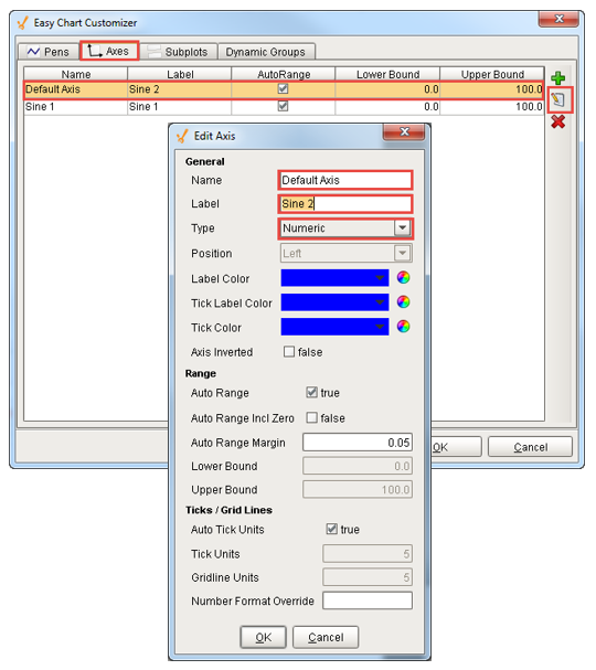
Now repeat the steps for Sine 2. Click on the Axes tab. You can leave the Name as ‘Default Axis’, and enter a Label and call it ‘Sine 2.’ Keep the Type as ‘Numeric.’ You can specify the colors on the Label, Tick Label and Tick Color. In this example, make them all blue and click OK.
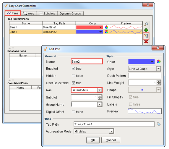
For the Sine 2 pen, we don’t need to change the Axis because we left the default name and only changed the Label to ‘Sine 2.’ To check, click on the Pens tab for Sine 2, select the Tag row then click the Edit Pen icon to change the Axis, otherwise, the ‘Default Axis’ will remain the default. Click OK and now both axes are different.
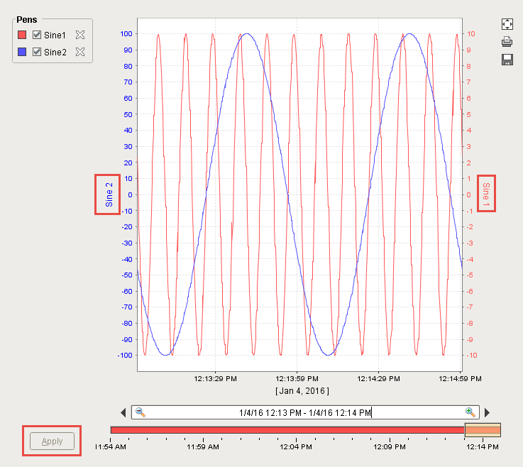
Once you press OK, you will immediately see Sine 1 and Sine 2 values change on the Easy Chart. On the right side of the chart, you can see the Sine 1 label and values. On the left side, you can see Sine 2 label and values. Now, you are using a different axis for each tag.

Go to Preview Mode, uncheck Sine 2 and click Apply. Now, the Easy Chart will only show the Sine 1 axis for the Sine 1 values.
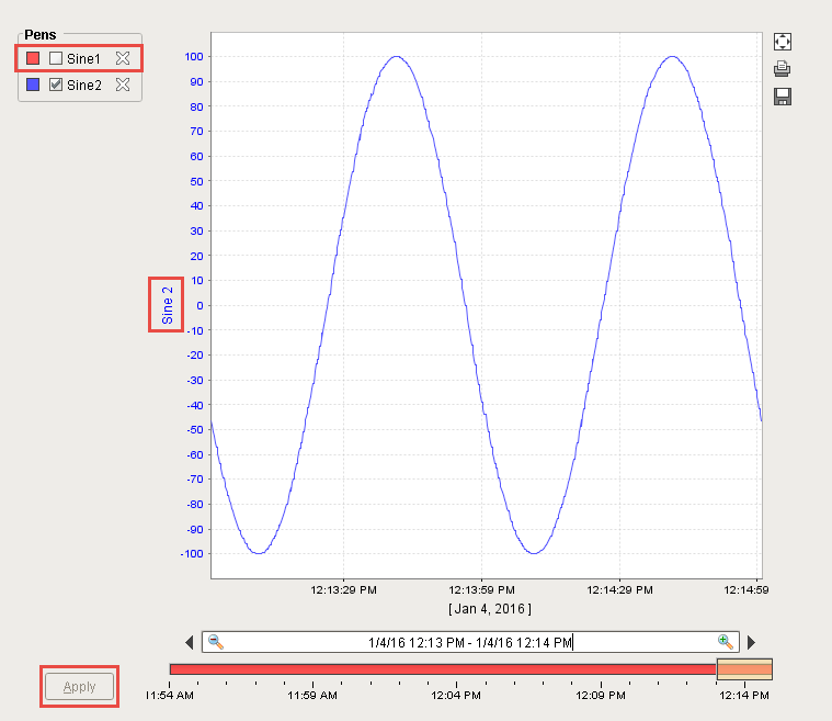
To see the chart for Sine 2 only, check Sine 2, uncheck Sine 1 and click Apply. You will only see the values for Sine 2 which is on the Default axis.
When looking at both axes in Preview Mode, you will see both values. Now, one Sine is not going to throw off the values for the other Sine. Select both pens and click Apply.
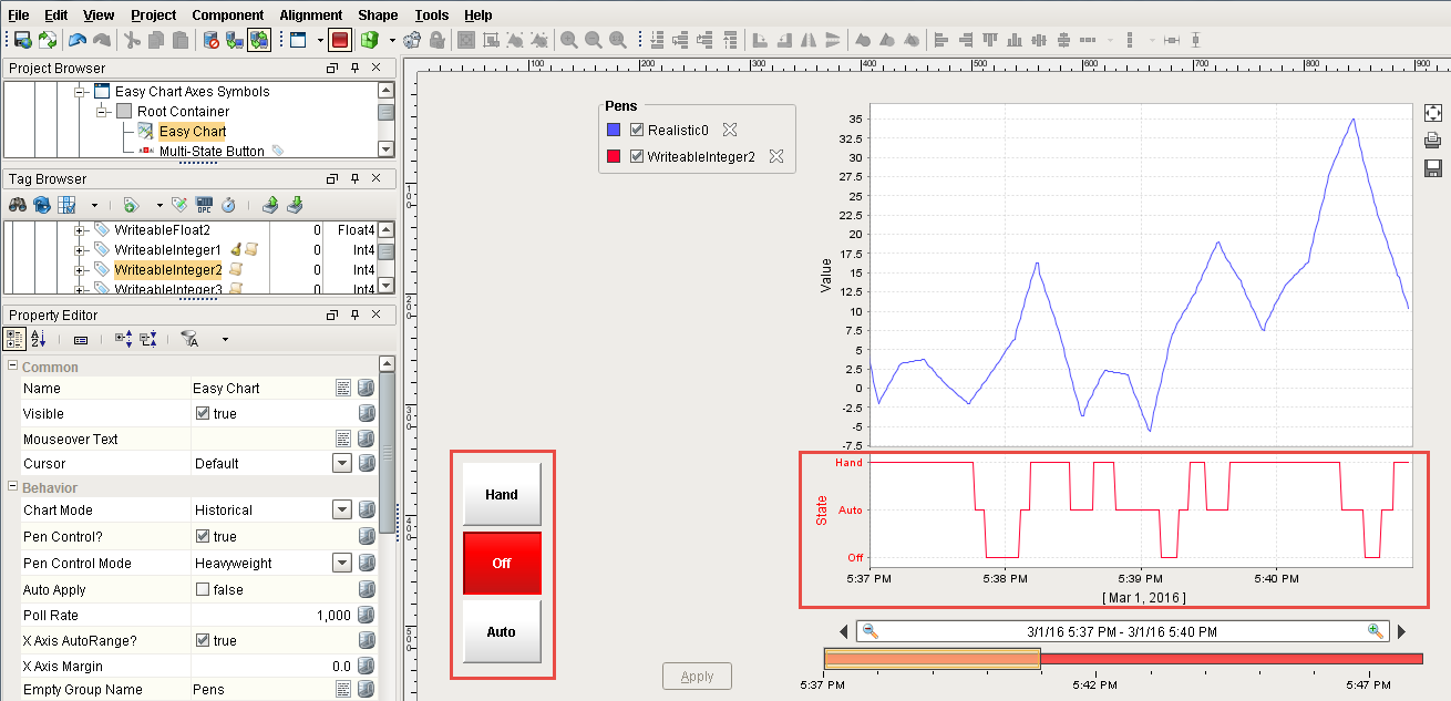
Symbol Axis Type Example
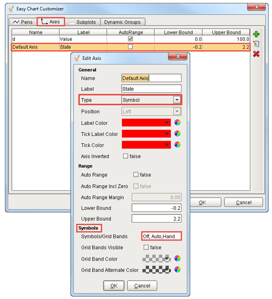
Another feature of the Easy Chart is the use of the Symbol axis type. The second subplot in this Easy Chart uses a Multi-State Button component to demonstrate the use of the Symbol type. The Multi-State Button component is bound to a tag named 'WritableInteger2'. Instead of using the default Numeric axis type to record the component's state as '0, 1, 2,' you can use On, Off, and Auto simply by typing the text in the Symbols field. This is helpful to an operator who immediately knows the state of the equipment instead of having to learn what the numeric values mean.
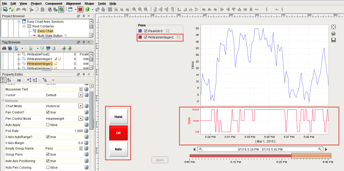
Go to the Easy Chart Customizer, click on the Axes tab and edit Axis for the WritableInteger2 pen. In this example, it is the Default Axis with the State label. You will notice that the type of axis selected is Symbol, lower and upper bound limits were set to provide a little padding at the top and bottom of the chart, and Off, Auto, Hand were entered in the Symbols/Grid Bands field. When entering text in the Symbols/Grid Bands field, always enter the text separated by a comma, and no spaces. Click OK two times.
Put your chart in Preview Mode and begin toggling the Multi-State buttons. You will then begin logging data to your Easy Chart. Data for the Multi-State Button component is collected in the second subplot which is using the Symbol axis type. The first subplot is data for another tag using the Numeric axis type.
This Easy Chart example shows the subplot feature of the Easy Chart component and how easy it is to break up the chart plot area into multiple distinct subplots sharing the same X axis. It is a good way to display lots of data from different tags in one Easy Chart.