Component Customizers
Using the Component Customizers
Ignition provides a number of Customizers to configure components in ways that are too complex or cumbersome for basic properties. In this page, the Customizers > Custom Properties and the Customizers > Styles Customizer are described. These two Customizers are used repeatedly for many different components. For special purpose components like the Easy Chart, Table, Tab Strip, and Multi-State Button, they have their own special customizers for you to create your own custom properties, such as the Easy Chart Customizer.
To use a customizer, right-click on the component and choose the Customizer menu, or use the Customizer split-button (  ) icon in the Vision main toolbar.
Expert Tip
Often, a Customizer is really just a user-friendly user interface to one or more expert properties. For example, all the Easy Chart Customizer really does, is to modify the contents of the pens, tagPens, calcPens, axes, and subplots Dataset properties. Knowing this is very powerful, because this means you can also use Property Bindings and scripting to modify the values of these expert properties at runtime, giving you the ability to dynamically perform complex manipulations of components.
Custom Properties
In addition to the component's basic property settings, you can also create your own custom properties to enhance and add functionality to a component. You can use the custom properties like any other properties - with data binding, scripting, styles, and so on. Custom properties are important for passing parameters from one window to another especially a popup window. Properties on the window's Root Container are special in that they double as a window's parameters. For example, when you click on a button to open a popup window, it will pass a certain set of values into the window, and then into the custom property (that you created on the Root Container) for use on that window. For more information, see Parameterized Popup Windows. You can see how custom properties can turn any "plain" component into one customized for your particular use.
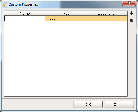
To configure the custom property
-
Right-click on a component and go to Customizer > Custom Properties.
The Custom Properties window is displayed. -
Click the black + icon in the upper right to add a row to the table.
-
Add a Name, Type, and Description for each custom property you want to add.
-
Click OK.
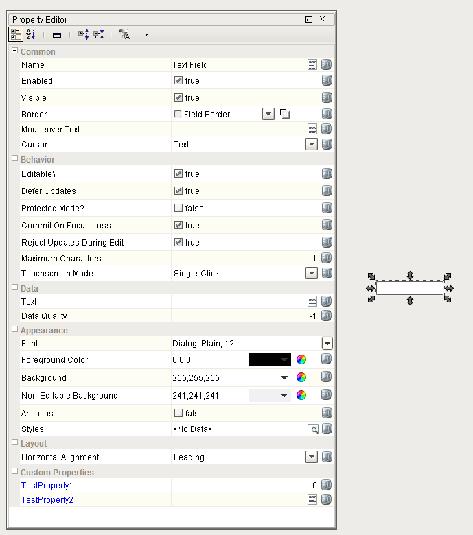
Notice the custom properties you added are displayed in the Property Editor in blue.
Style Customizer
Many components support the Style Customizer which lets you define a set of visual styles that change based on a single Driving Property. Typically, you'll have a property (often a custom property) on your component that you want to use as a driving property, usually a discrete state, and you have multiple visual properties, like the font, border, foreground color, visibility, and so on that you want to change based on that one driving property. Style Customizer lets you define these relationships all at once, and lets you preview them too! Without styles, you would have to go to every property and bind them all individually.
Configuring the Style Customizer
Some components have styles already setup and others do not. The following example involves a component that already has a styles defined.
-
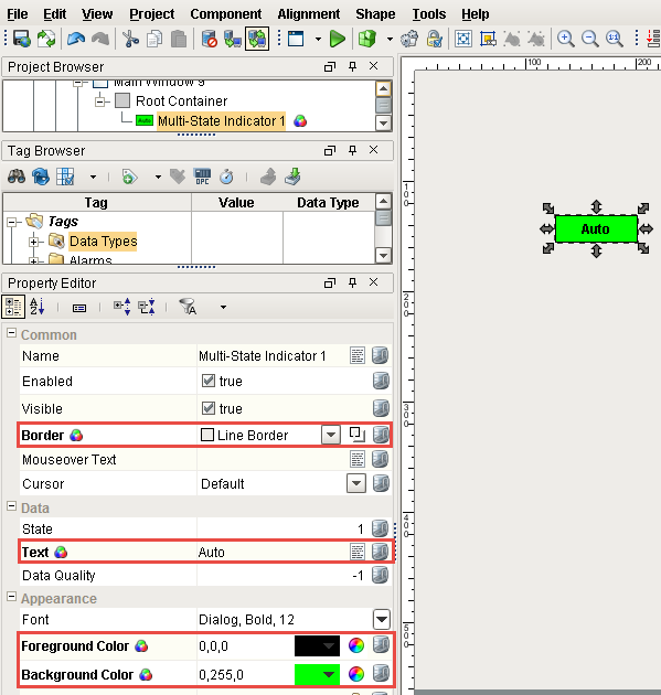
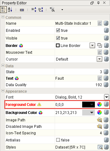
Drag in a Multi-State Indicator from your component palette on to your window. Right click on the component and notice in the Property Editor that several properties appear in bold with a paint canvas icon next to them letting you know that they are used in a style.
-
Right click on the Multi-State Indicator component and scroll down to Customizers > Style Customizer.
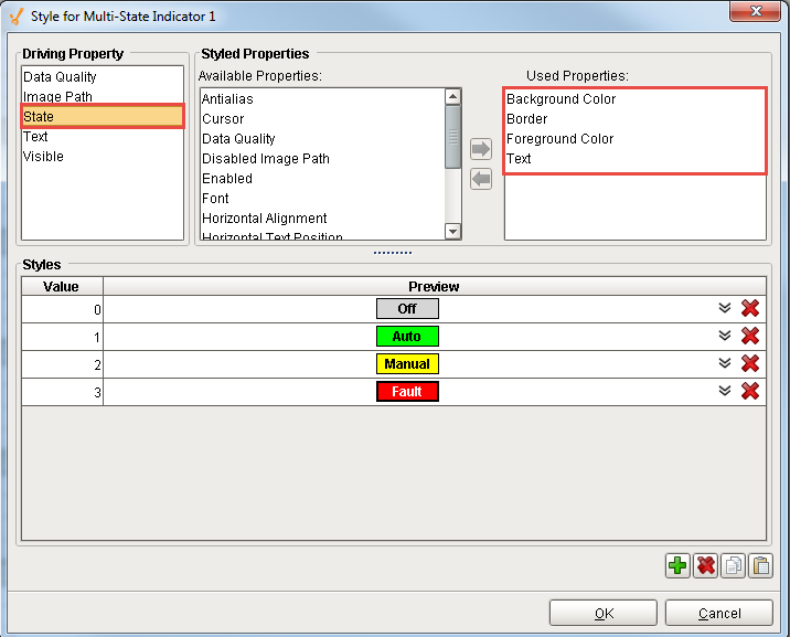
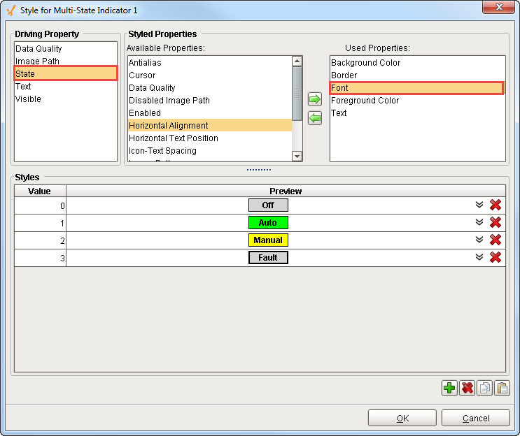
Since styles are already setup on this component, you’ll notice that it already has a driving property selected. The driving property is State and it uses multiple visual properties like Background Color, Border, Foreground Color and Text which are already configured.
-
Styles are totally customizable. If you don’t like the pre-defined style for the preset values for the Multi-State Indicator, you can change it. You can add or remove styled properties. Adding and removing a styled property affects all the Values under the component. In this example, the Font property was added.
-
For each Value property, you can change its styled property to fit your requirements.
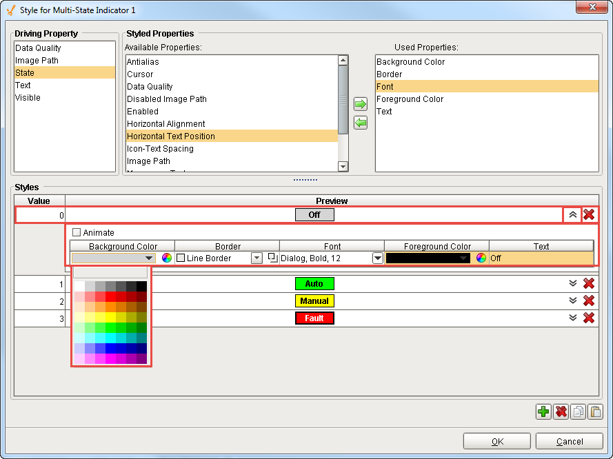
Click the Expand icon and see all the styles for the Value '0'. Starting with Background Color, click on the dropdown list to change the color. You can configure all the styles you want to change: Border, Font, Foreground Color and Text.
You can change the styles for any Value in this Multi-State Indicator component. You can Preview each change after you make it.
-
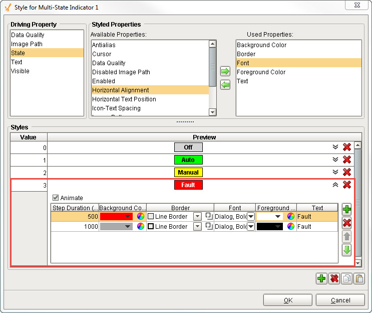
With the styles feature you can ‘Animate’ between different styles on the same State. To Animate, you can add one or more rows and set the style for what you want those new rows to look like.
In this example, expand Value '3' and you will see that the Animate box is checked. Two rows were added and each animation step has a different background and foreground color set along with a Step Duration set in milliseconds to control the blinking between the 2 steps. You can add many steps and each step can have a different duration. See how it works in Preview.
Press OK.
-
Change the State to '3' to see the component blink ‘Faulted’ and switch between the background and foreground colors you setup.
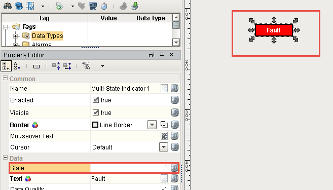
Once your styles are setup, you can see styles coming through on the Multi-State Indicator component as it moves through the different States. In the Property Editor, you will notice that the Border, Foreground Color and Background Color properties are bold letting you know that they are used in styles
Value Conflict
You can bind a property that is already being used by a style, but a warning icon will appear on the property, and the property name turns red in the In the Property Editor. This means there is a conflict between the binding on the property, and the style on the component. As a general practice, only the style or binding should write to the property, not both.
So as you can see, it's easy to change all the properties from one location using the Styles Customizer.
Example 1
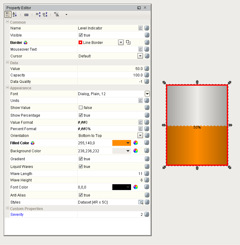
Lets say that you have a Level Indicator component that is displaying the level in a tank. Lets say that you want to have its appearance change based on the alarm state of the tank's temperature. You can add an integer custom property, call it Severity, to the level indicator that you'll bind to the tank temperature tag's AlertCurrentSeverity property.
Now go to the Style customizer. Choose your
Severity
property as the driving property, and the Border and Filled Color properties as the styled properties. Add states for -1 (not in alarm), 2 (Medium alarm) and 4 (High alarm). Leave the -1 state alone. Use a red border for state 2 and an orange fill color. For state 4, you can animate it to get a flashing effect. Add two animation frames and set their delay to 500ms each. Configure the frames differently from each other so that you can get a flashing effect. Click OK and notice that the styled properties you chose are now bold and have the styles indicator (  ) next to them. This is to help remind you that those properties are being driven, so if you change their values directly, your changes will be overwritten.
Example 2
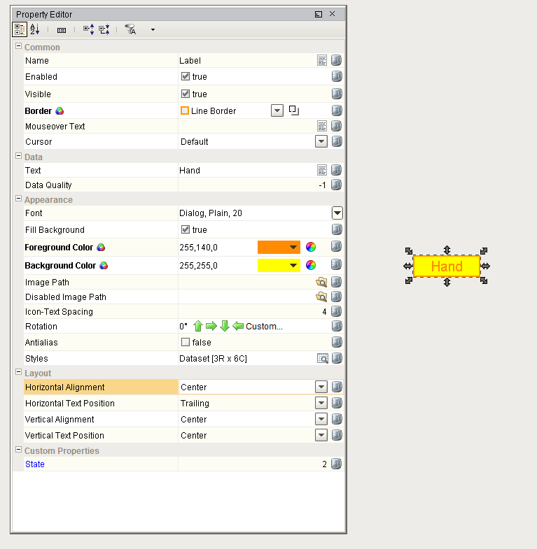
Let's look at another example that uses the Custom Properties and the Styles feature together. Take the Label component. It seems pretty plain at first - it just displays a String. Of course, you can use its foreground color, background color, and border to make it look interesting. Add an integer custom property on it and name it state, and bind that property to a discrete state tag coming out of a PLC. Now use the State property to drive its Styles configuration to make the component look different and display different things based on the state being 0, 1, or 2 (maybe for a Hand/Off/Auto indicator).
We could have used the Multi-State Indicator component from the very beginning, but understanding this example will let you create your own types of components by combining the existing components in creative ways.
Some components like the Easy Chart, Tables, Tab Strip, and Multi-State Button/Indicator already have default styles already setup, but you can modify them however you like. If you don't like the default styles, change them! They are there to simply help you get started.
Similar Topics ...